Studio 44
A neighbourhood workspace where new ideas are born at the intersection of independent creative practices.
Studio 44 is a shared creative workspace in Redfern, home to a range of independent practices. We were engaged to create an identity that could bring these disciplines together by establishing a shared visual language with enough flexibility to reflect the range of people and ideas within the space.
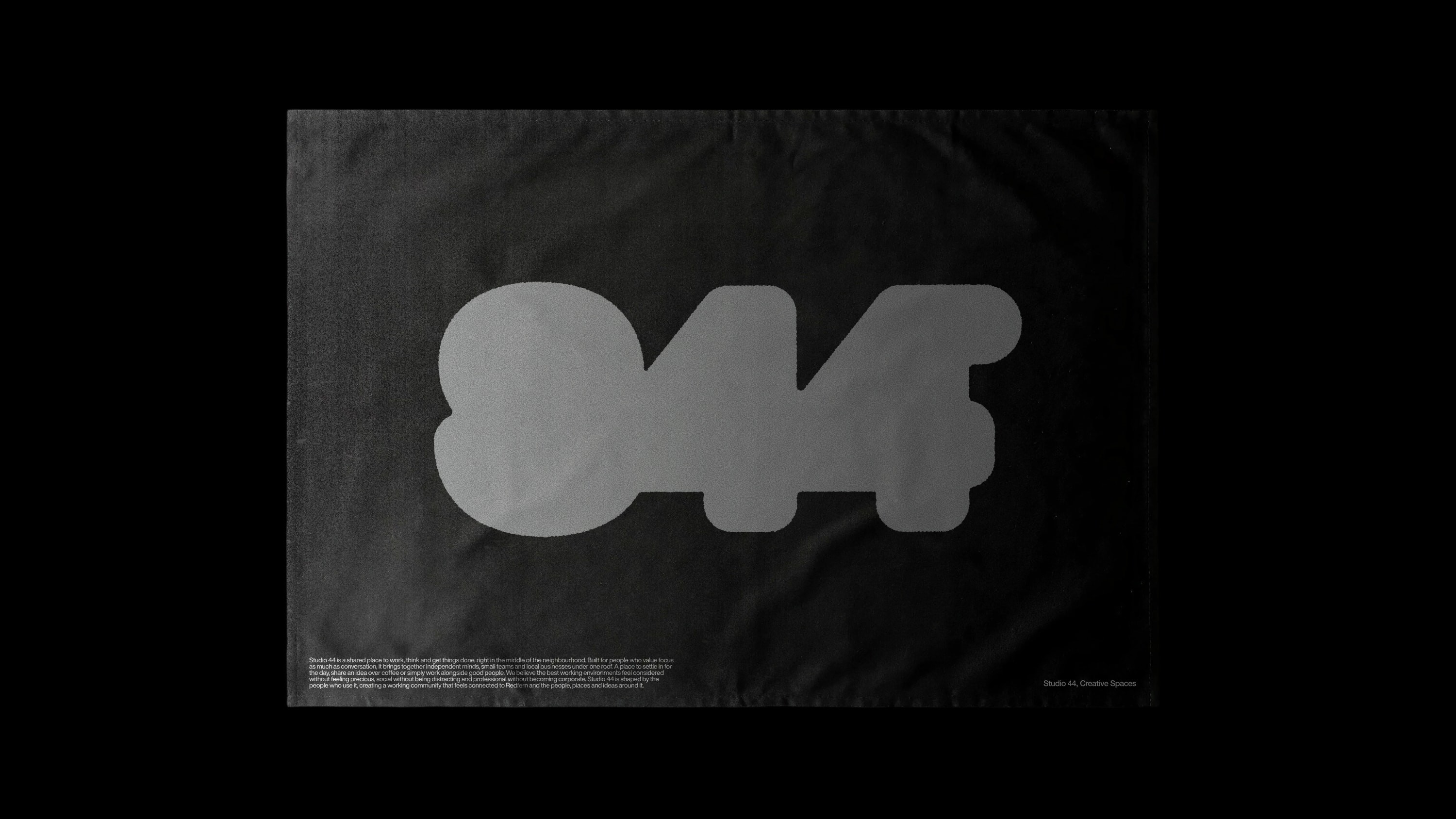
The identity took cues from Letraset, the dry-transfer lettering system once used to compose typography by hand. Its balance of precision and imperfection felt particularly relevant to Studio 44, housed within a converted mid-century manufacturing warehouse. References to Letraset and printmaking connect to the building’s industrial past, while grids and registration marks reflect the creative practices occupying it today.
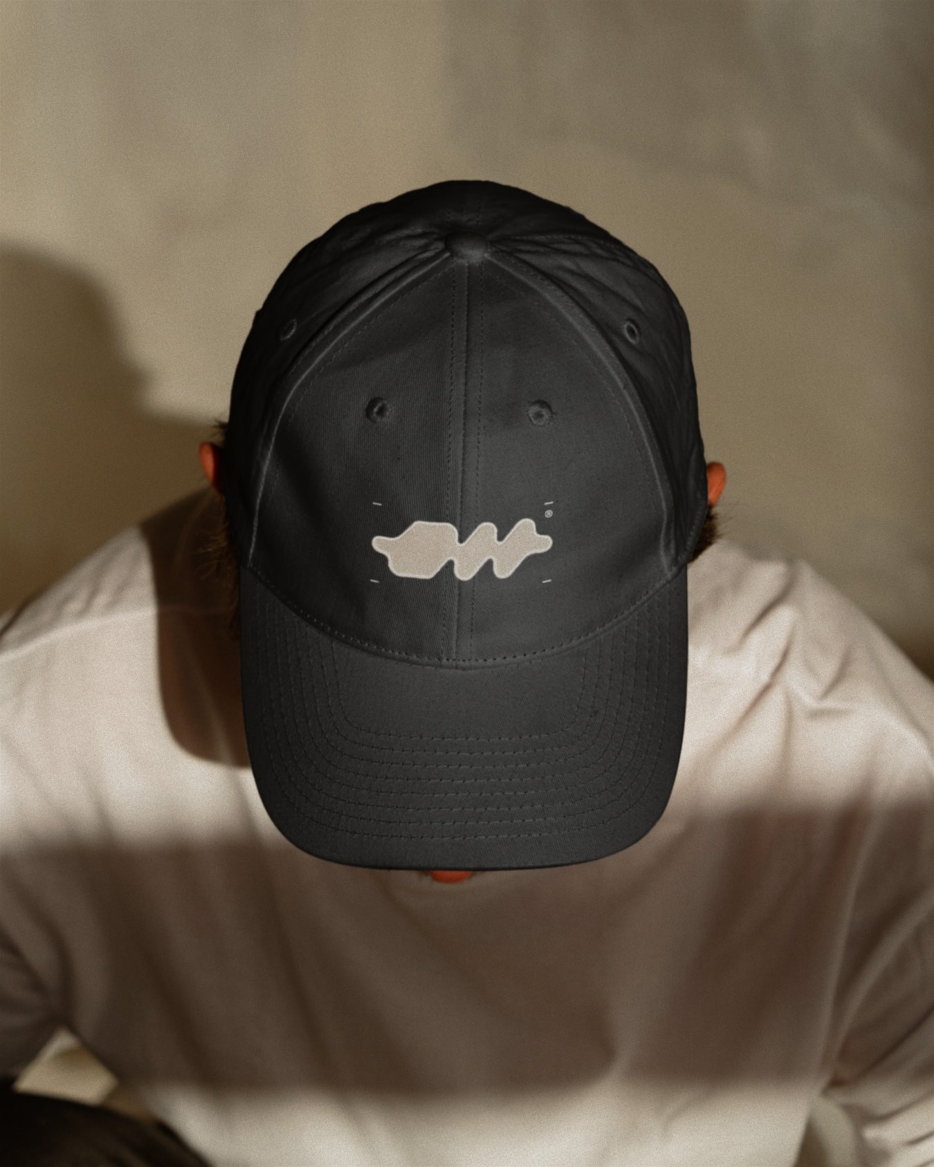
We developed a suite of logo marks ranging from pragmatic typographic wordmarks to more abstract forms. Each has its own character but shares a common visual logic, reflecting both the individual practices within Studio 44 and the points at which they intersect.
The identity connects the building’s history with its new life as a multidisciplinary creative community, creating a framework for different practices, people and ideas to come together.
Year
2026
Service
Branding, Design
Sector
Place Design
Recognition
AGDA, Finalist, Brand (Small Business), 2026

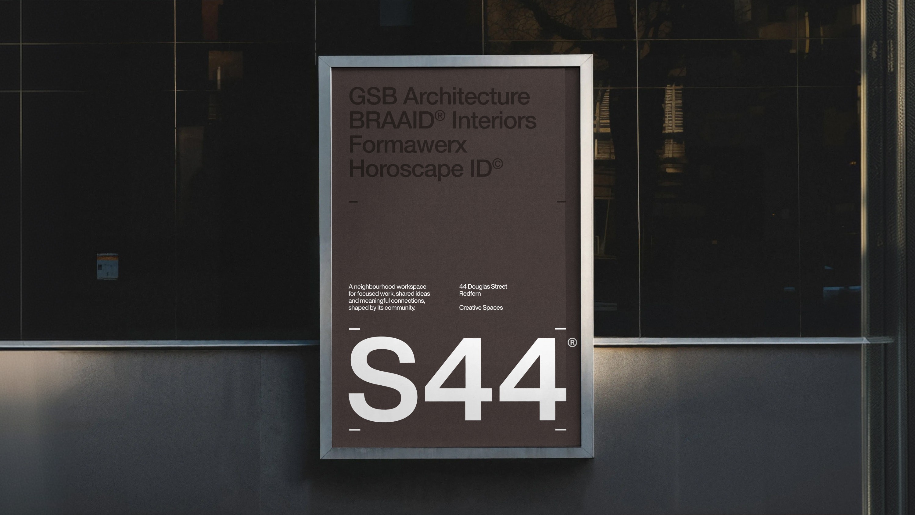

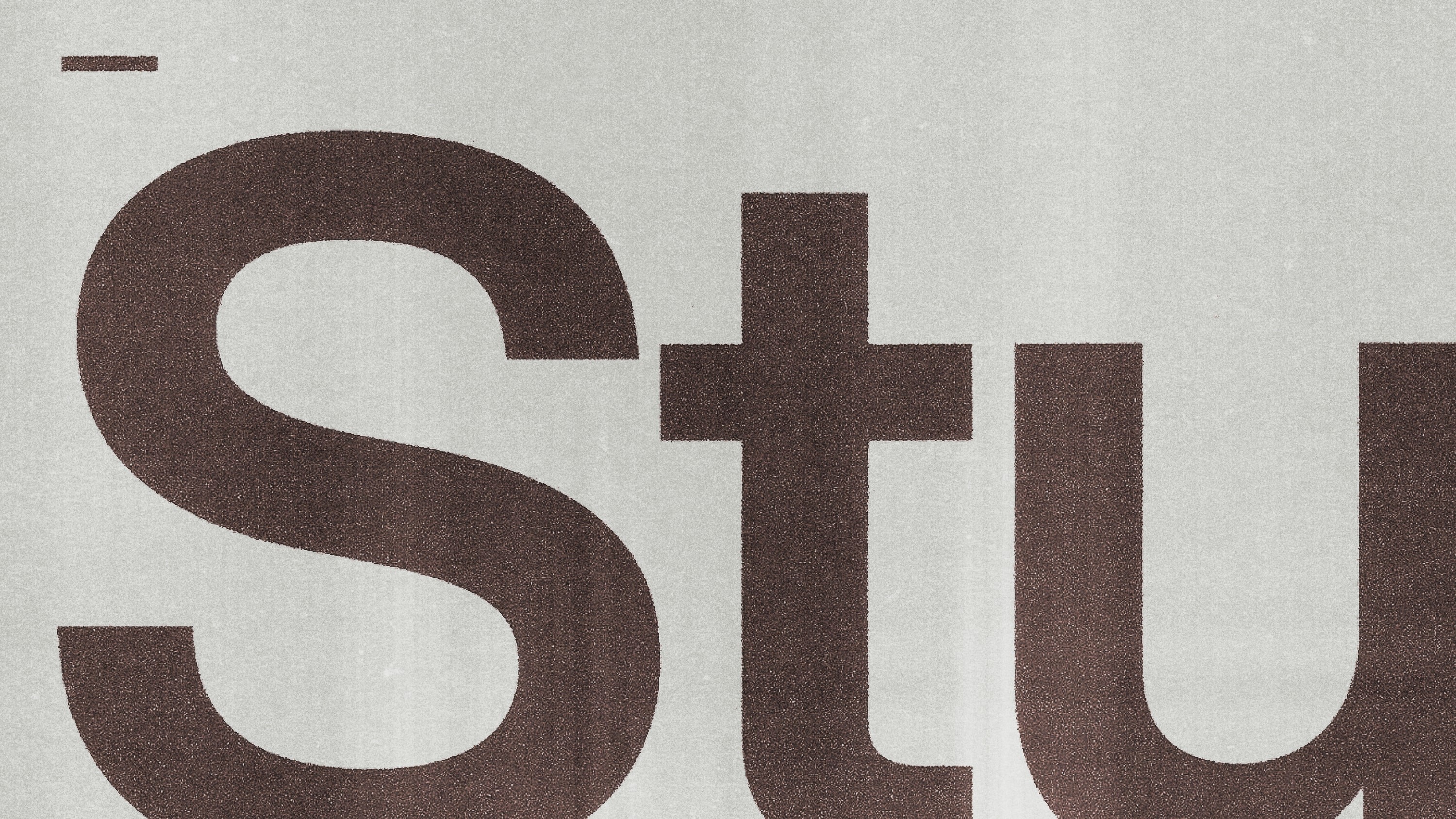
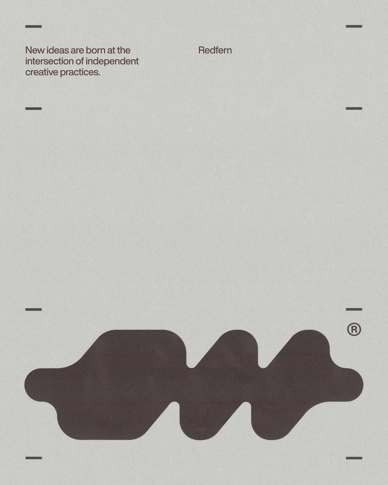
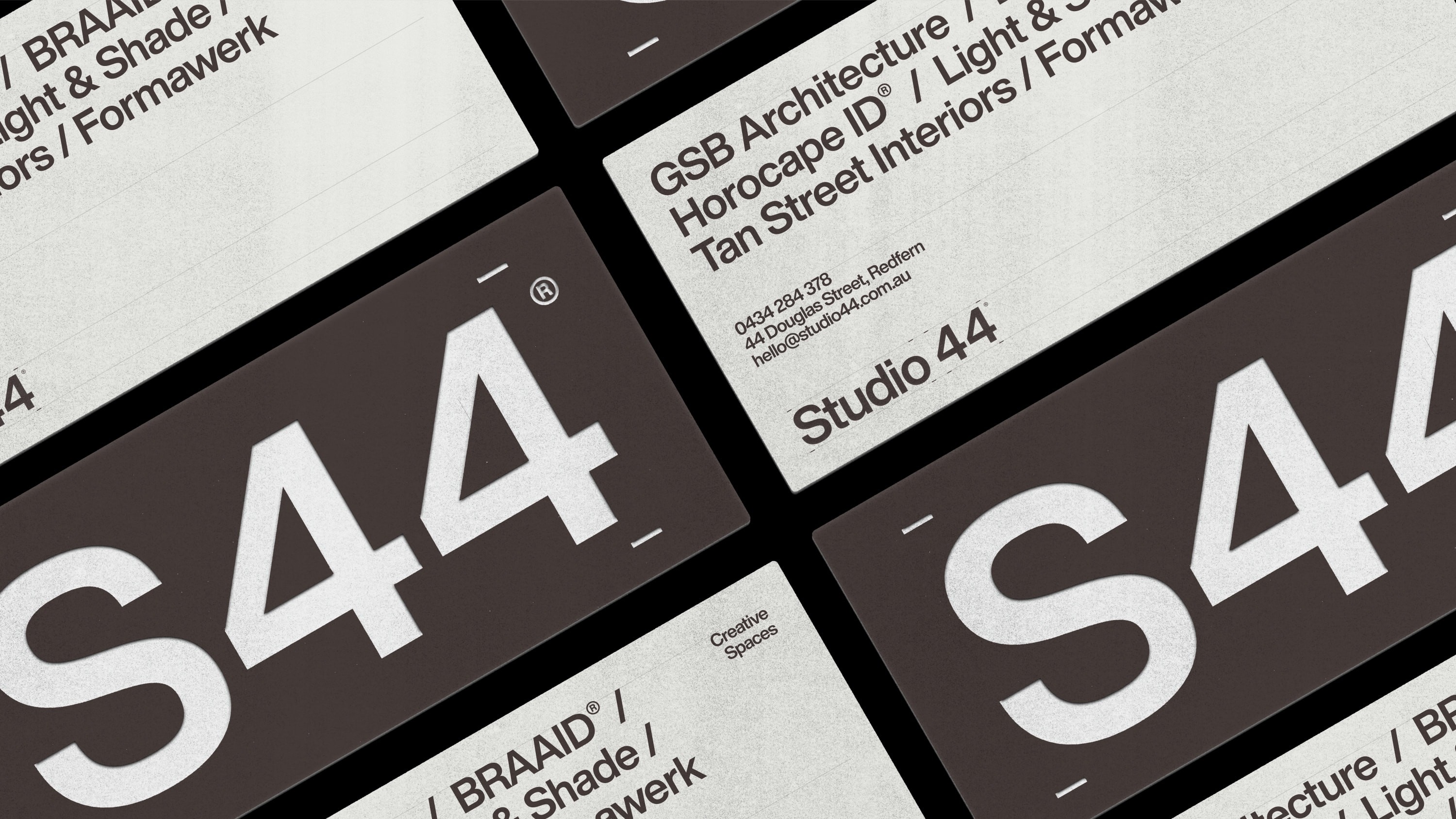
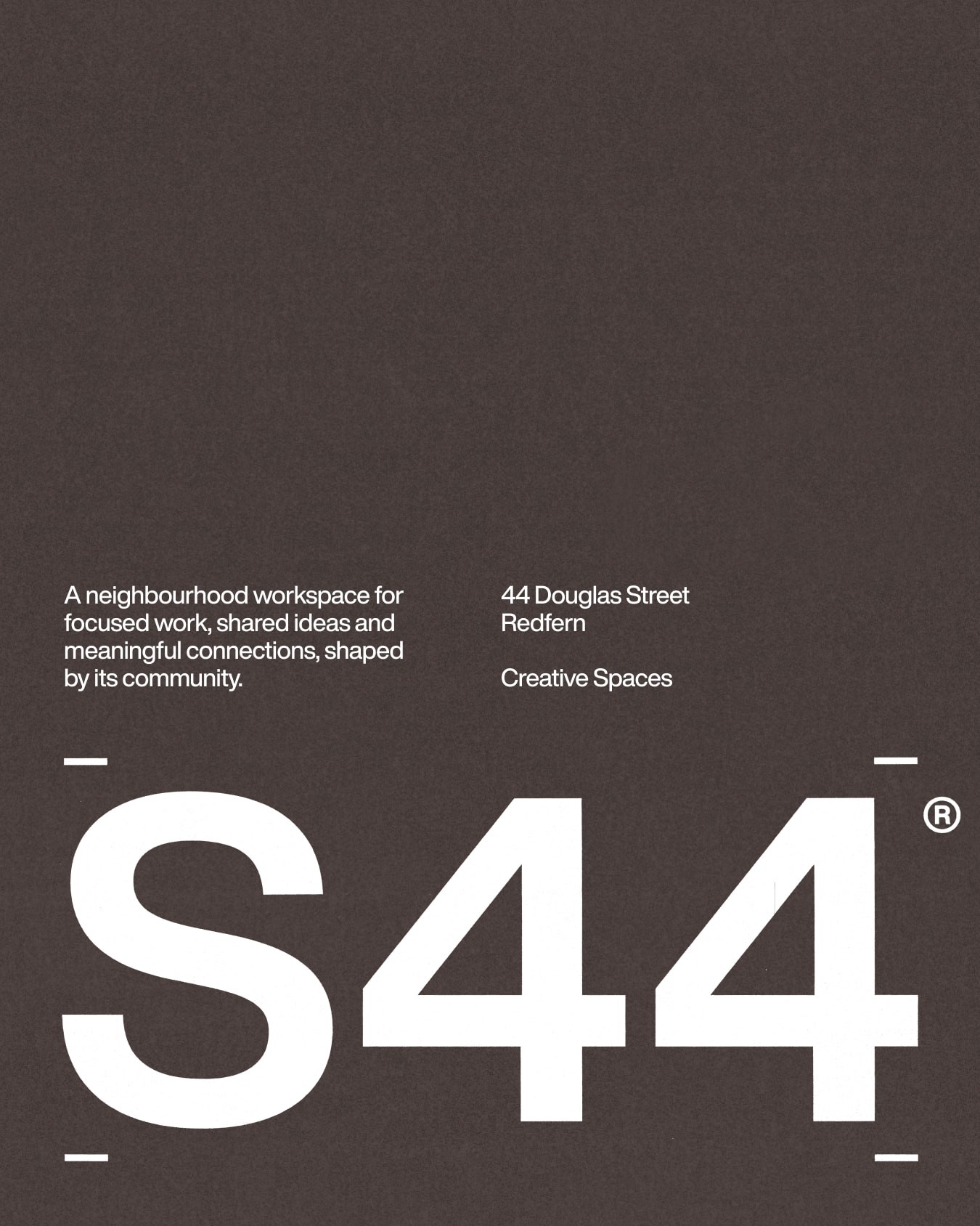
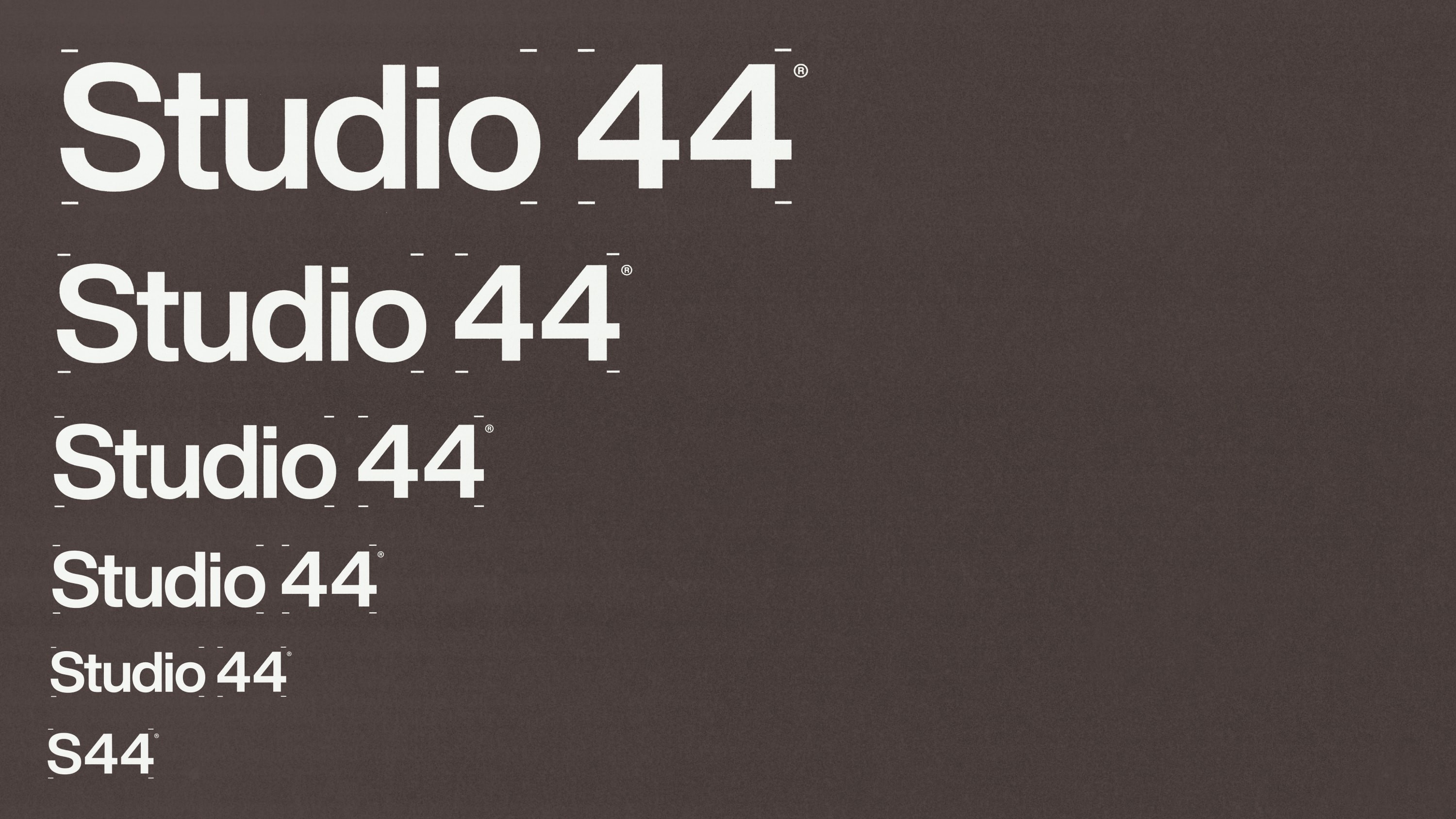
Across the identity, Letraset inspired registration marks frame type, imagery and information. The marks act as a framework to create spaces to be occupied.

Studio 3AM
Studio Director: Jonathan Key
Creative Direction & Design: Marty Luther
Project Management: Ria Gibson
Fonts Used
Tiny by Philipp Nurullin & Konstantin Bulenkov, JetBrains