Peanut Archivo
An experimental display typeface distorting Archivo Black into pixelated, interlocking forms.
Year
2026
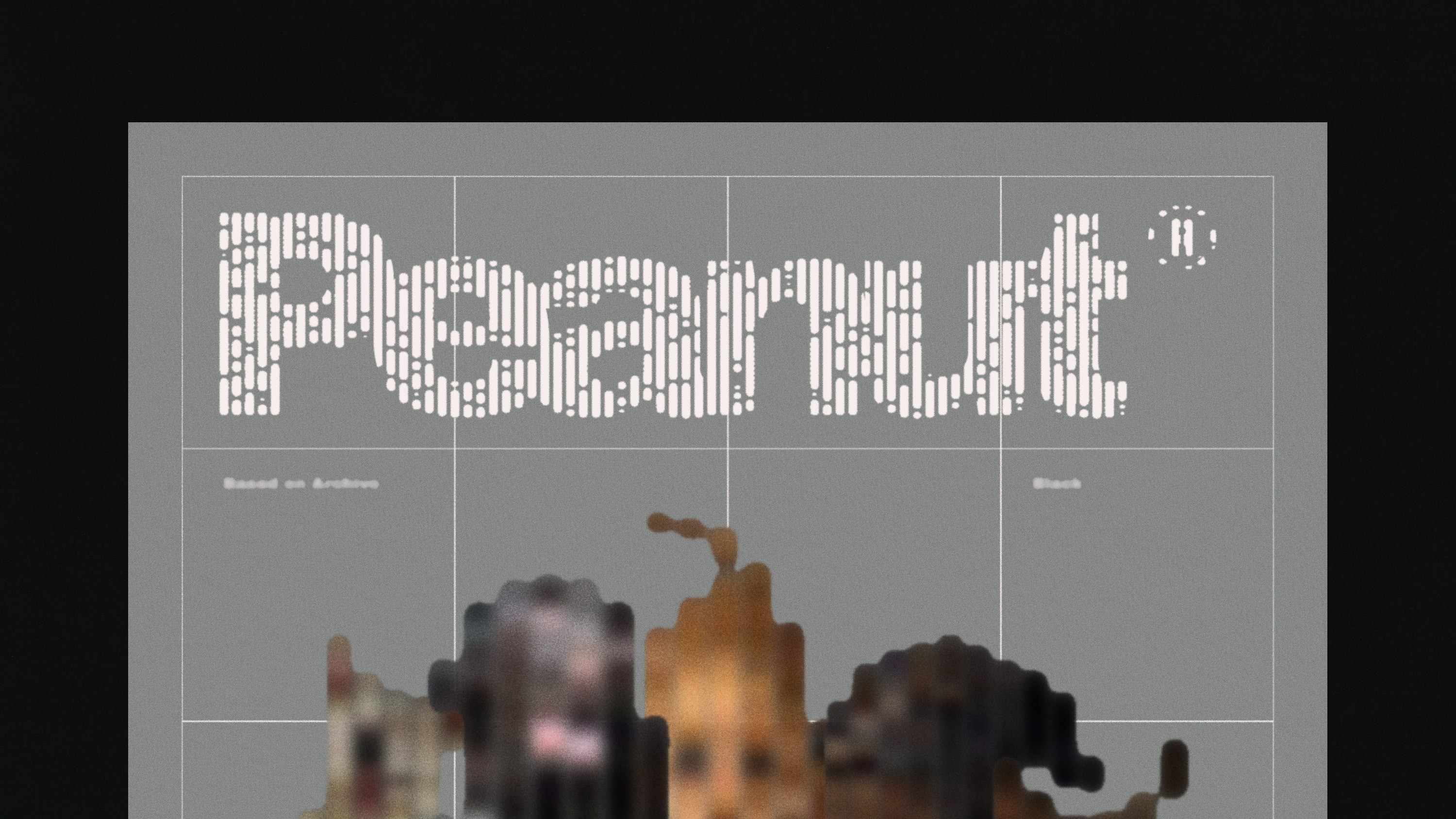
Peanut Archivo is an experimental display typeface built from Archivo Black, originally designed by Omnibus-Type and released under the SIL Open Font License.
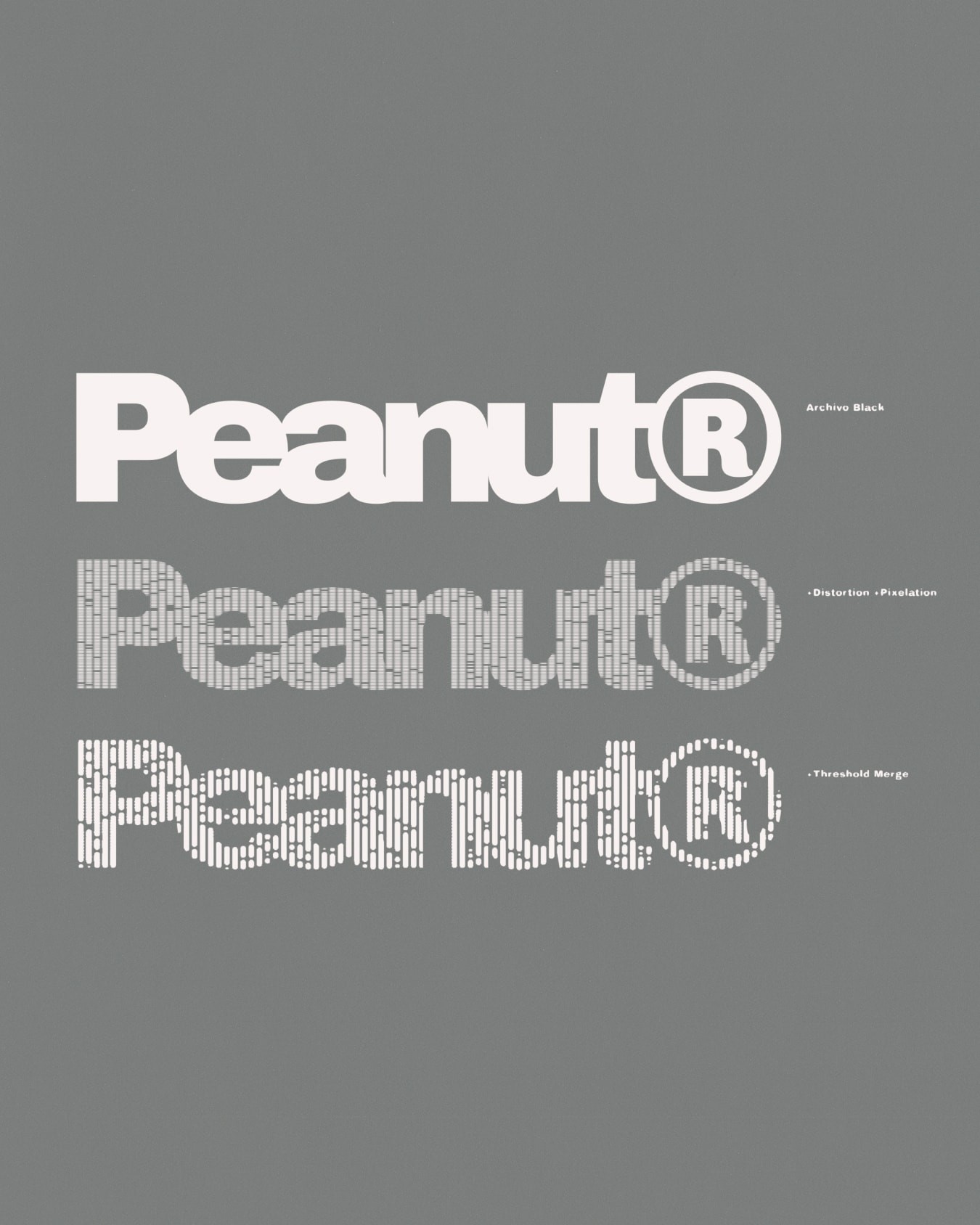
The typeface began by disrupting Archivo’s dense, highly legible forms through pixelation, distortion and fluid vector manipulation. Vertical stems swell, collapse and bleed into one another, creating irregular gaps, softened edges and, occasionally, the pinched shape that gave Peanut its name.
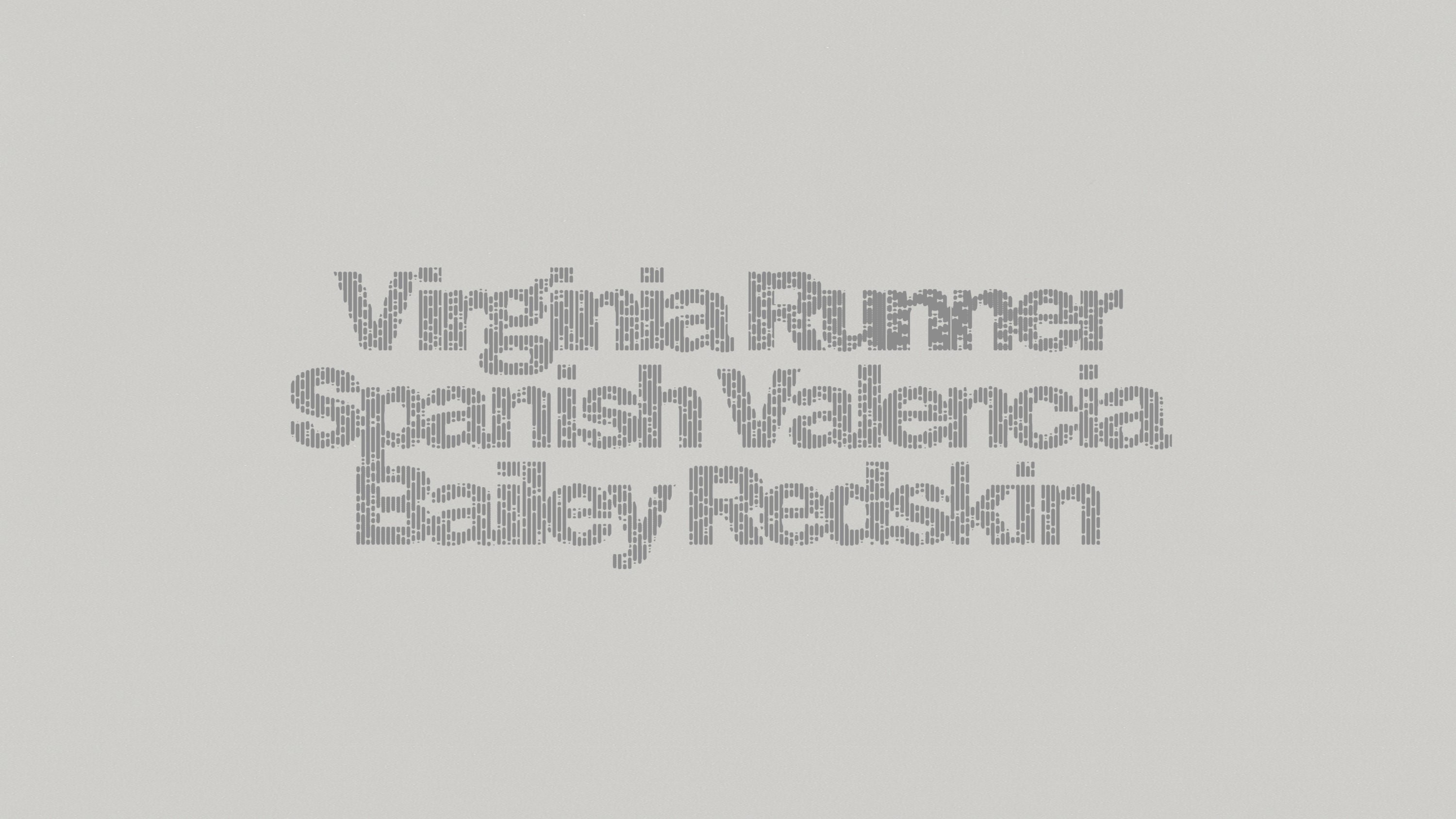
Archivo’s weight and clarity provide enough resistance for the letters to withstand significant distortion while remaining readable.
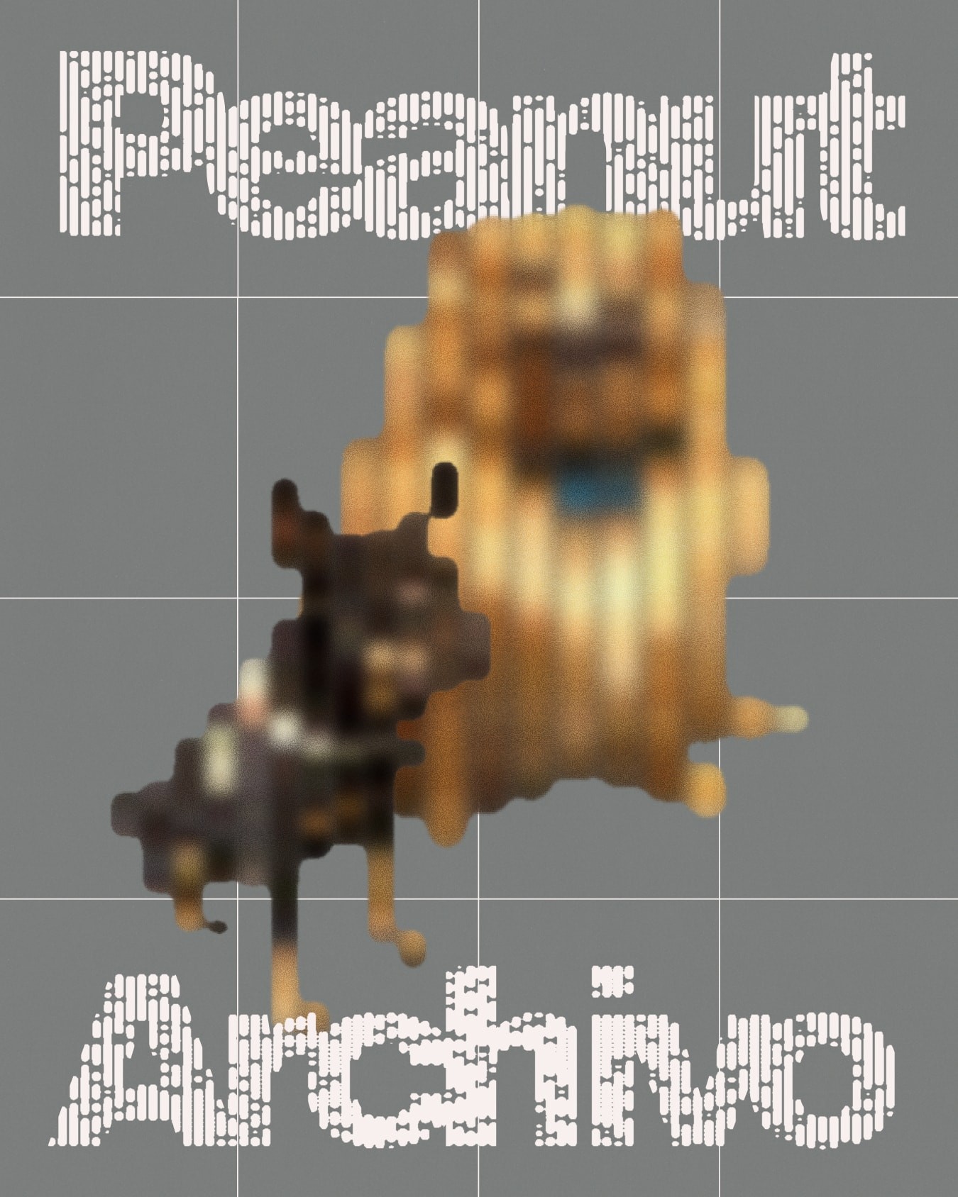
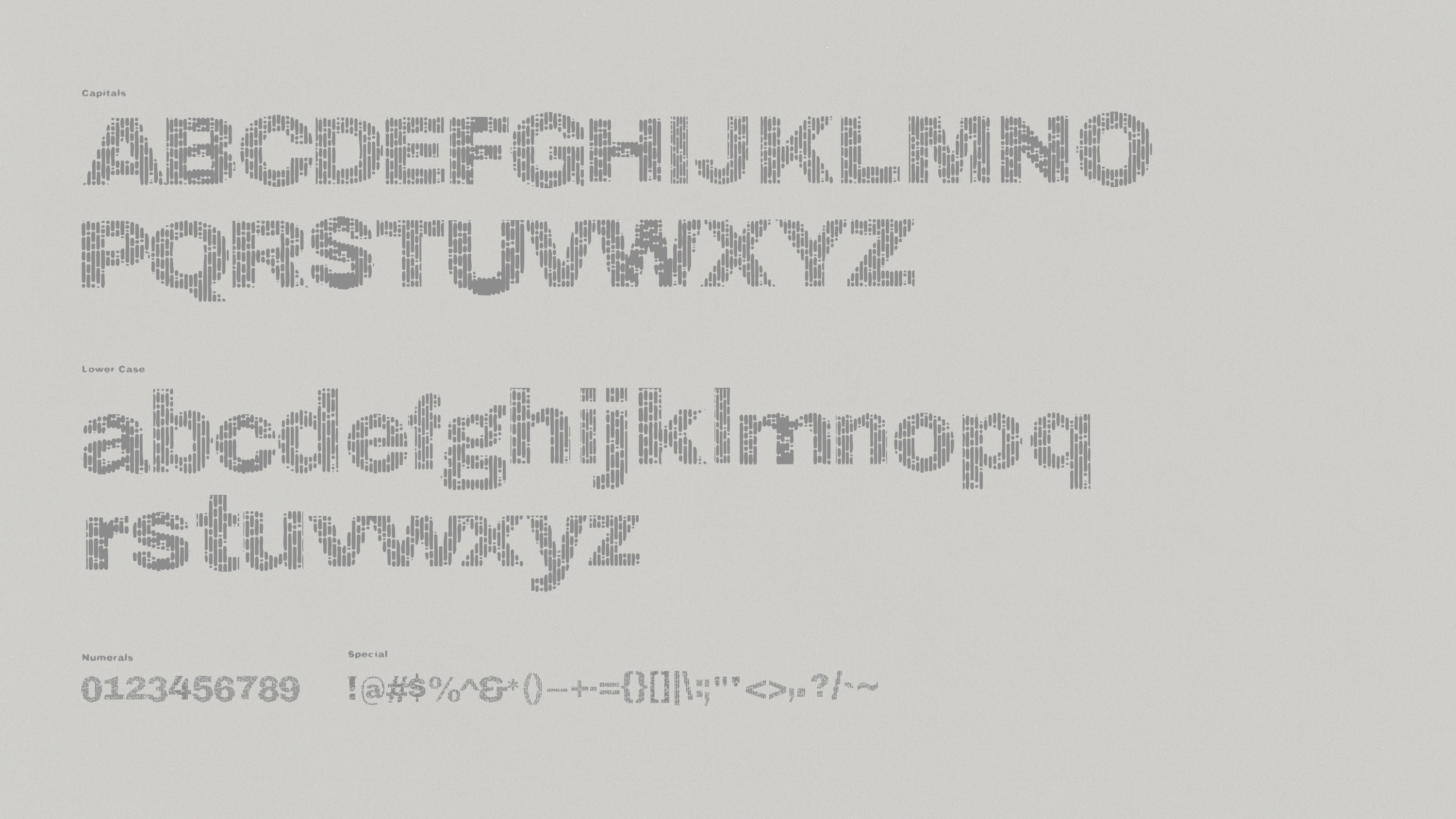
The distortions become particularly apparent when Peanut is set tightly. Adjacent vertical forms can overlap, interlock or appear to merge, allowing words to behave almost like constructed wordmarks rather than a sequence of individual letters. Used with care, spacing becomes part of the drawing process, producing unexpected joins and negative spaces between characters.
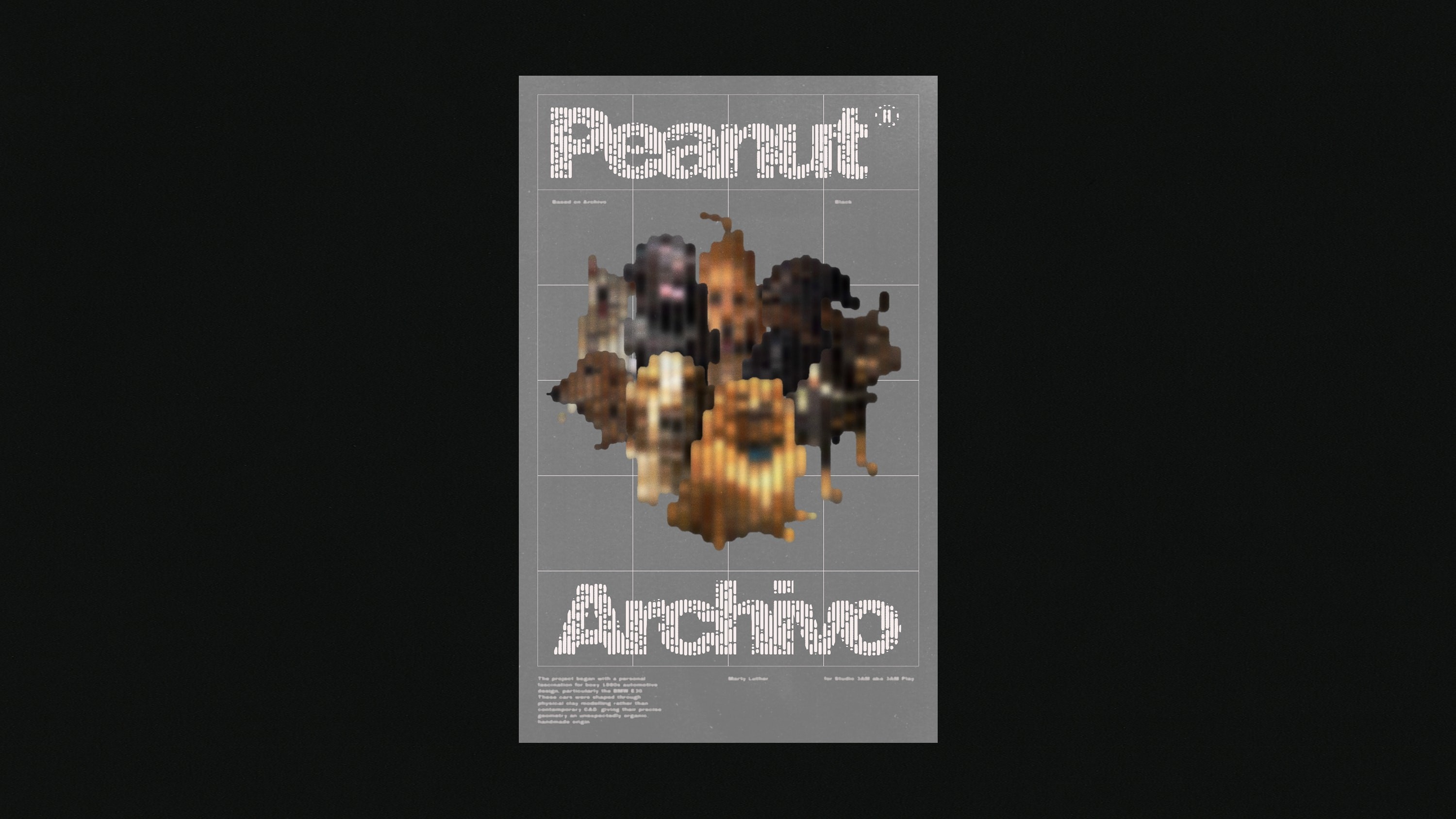
Peanut is being designed as a freely distributed typeface, continuing the open-source conditions of Archivo. Coming Soon.
Studio 3AM
Marty Luther
Based On
Archivo Black by Omnibus-Type, SIL Open Font License