DomeFest
The ultimate podcast fan festival, bringing podcast fandoms together to celebrate the format and connect listeners with their favourite hosts.
As Australia’s first podcast fan festival, DomeFest needed to carve a strong and memorable presence ahead of launch. The brief was to create a brand identity that champions community through podcasting, connects to the parent Dome brand, and captures the energy and momentum of a festival.
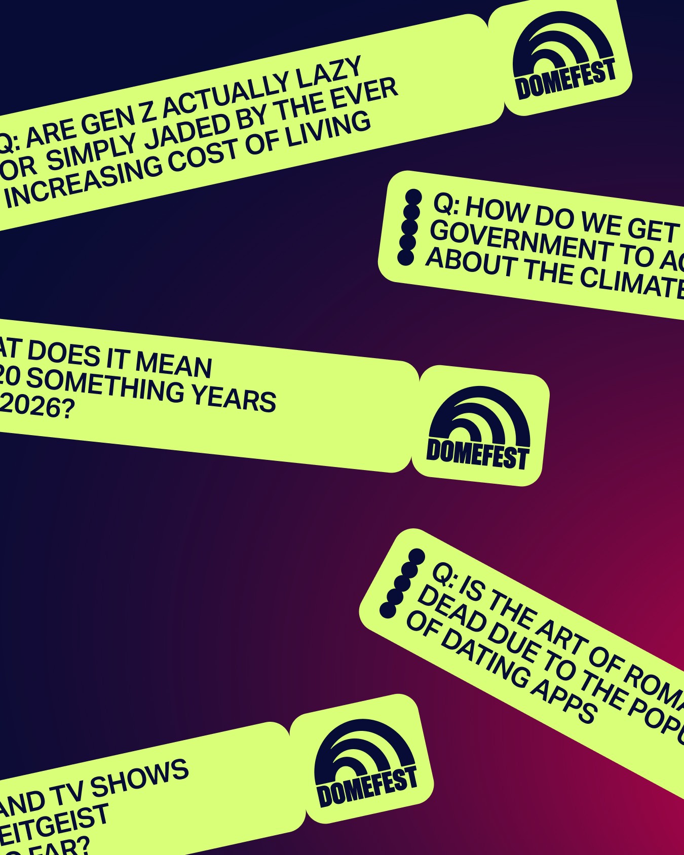
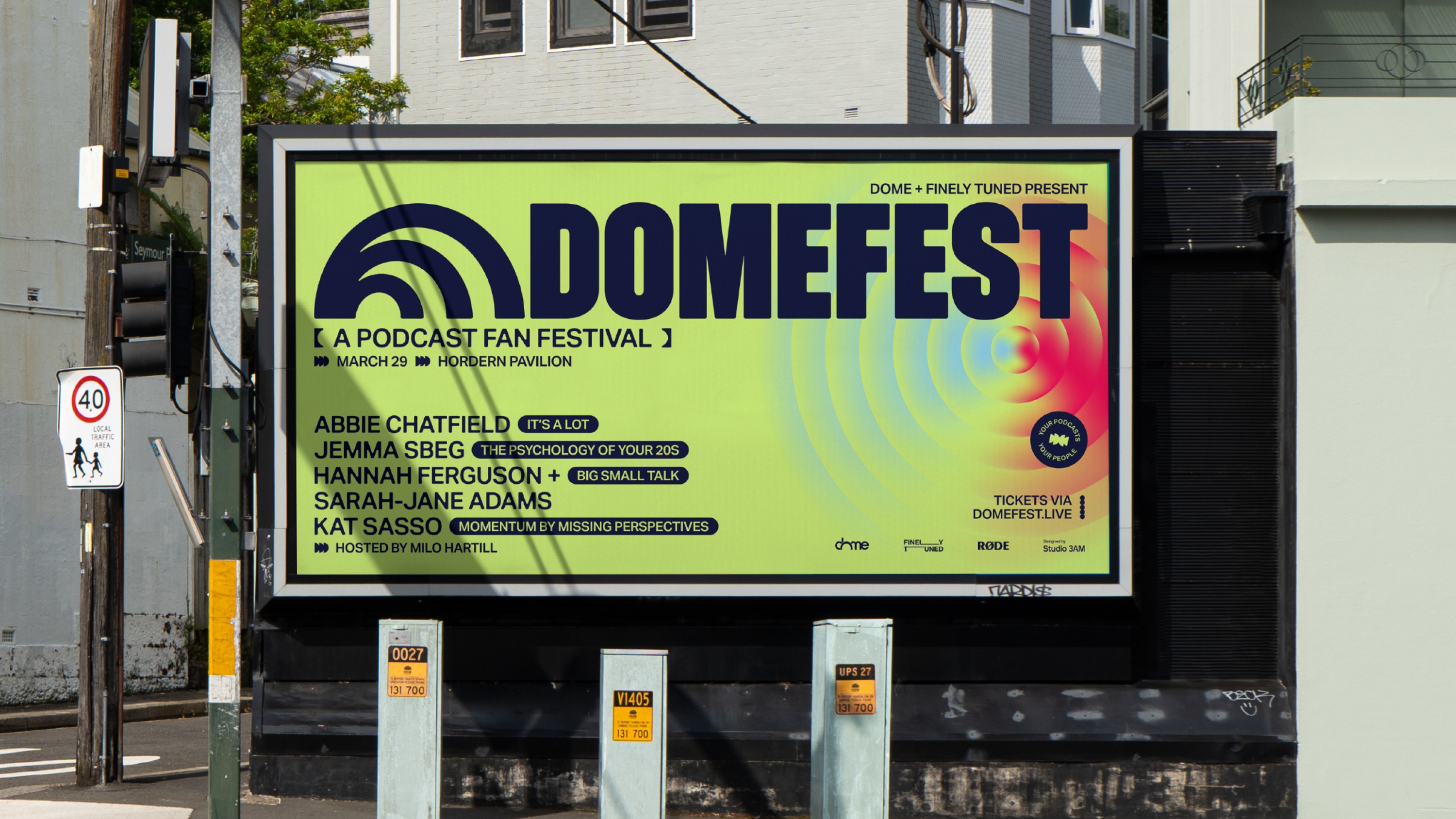
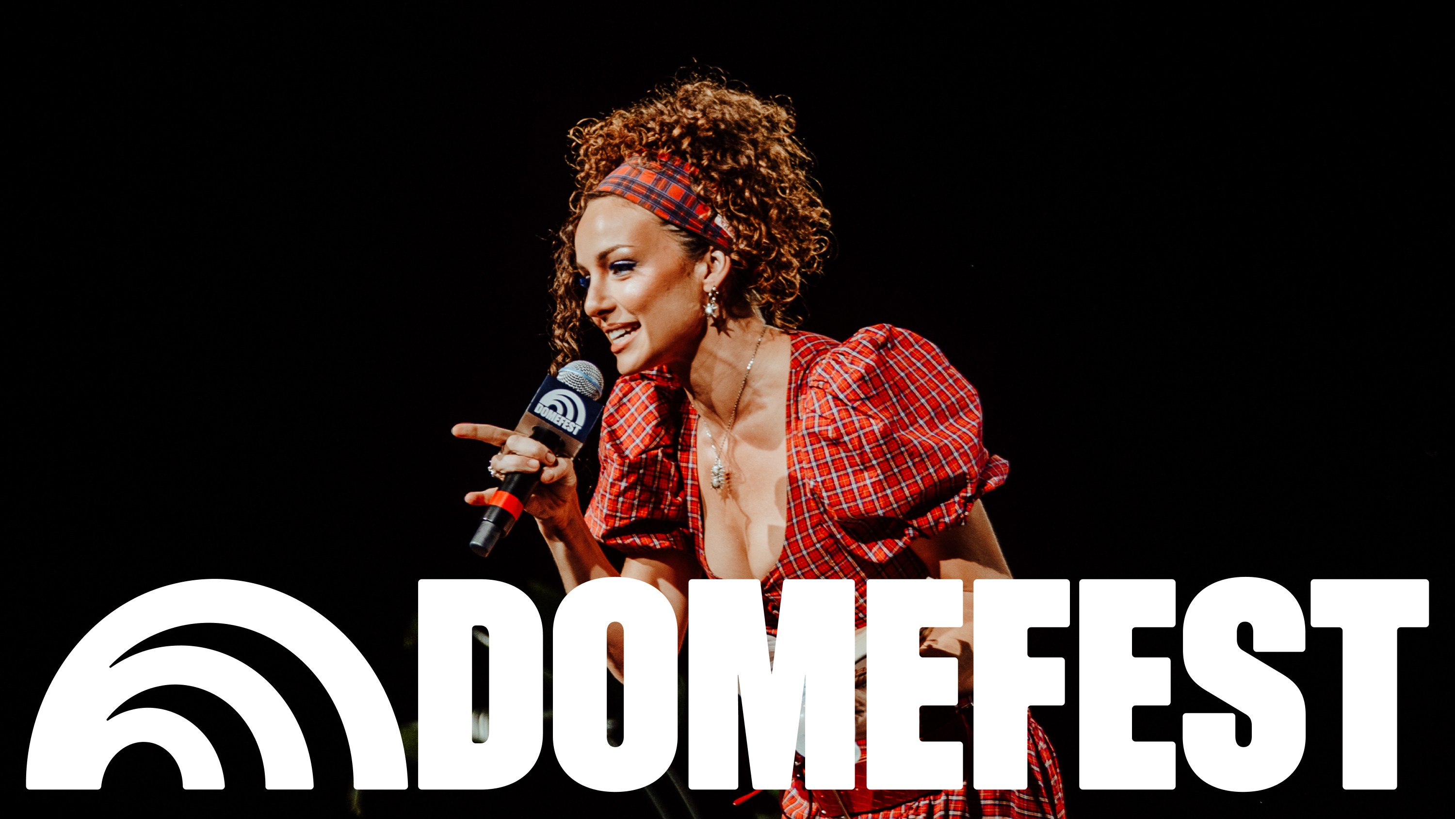
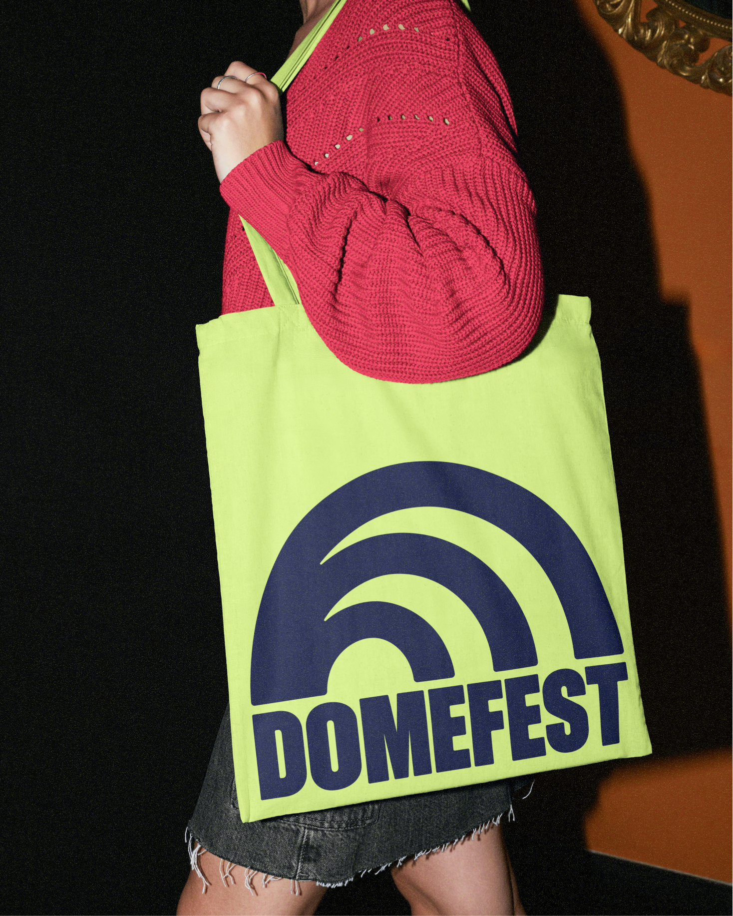
Our approach drew directly from the dome shape in the original Dome logo, reinterpreting it as a symbol of collective voice and amplification. This evolved into a dynamic logomark and hero graphic system featuring rippling elliptical forms, visualising how individual voices expand and resonate when communities come together.
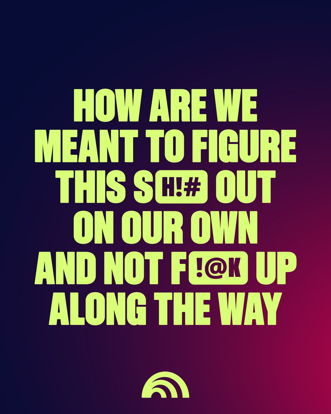
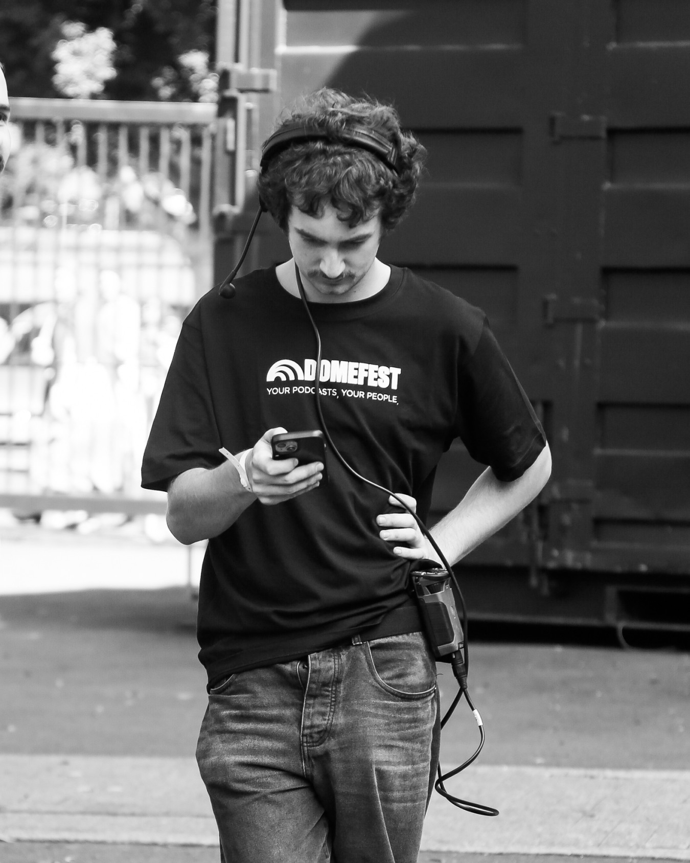
To balance the energy of a festival with the intimacy of podcasting, we developed a flexible design system. Bold typography and vibrant colours conveyed scale and excitement, while organic textures, gradients, micro-graphics, and rounded forms added warmth and reflected the personal nature of listening to podcasts.
What made the identity distinct was how we approached crafting the graphic language for a new category of festivals in Australia. Rather than distancing from the eye catching graphic language of established formats like music festivals, we drew on their strengths and adapted these for DomeFest to ensure podcasting and community remained central to the identity. The result is an identity that feels instantly familiar yet entirely its own: a brand built around conversation, with the DomeFest experience at its centre.
Year
2026
Service
Design, Motion, Branding
Sector
Events & Experiences

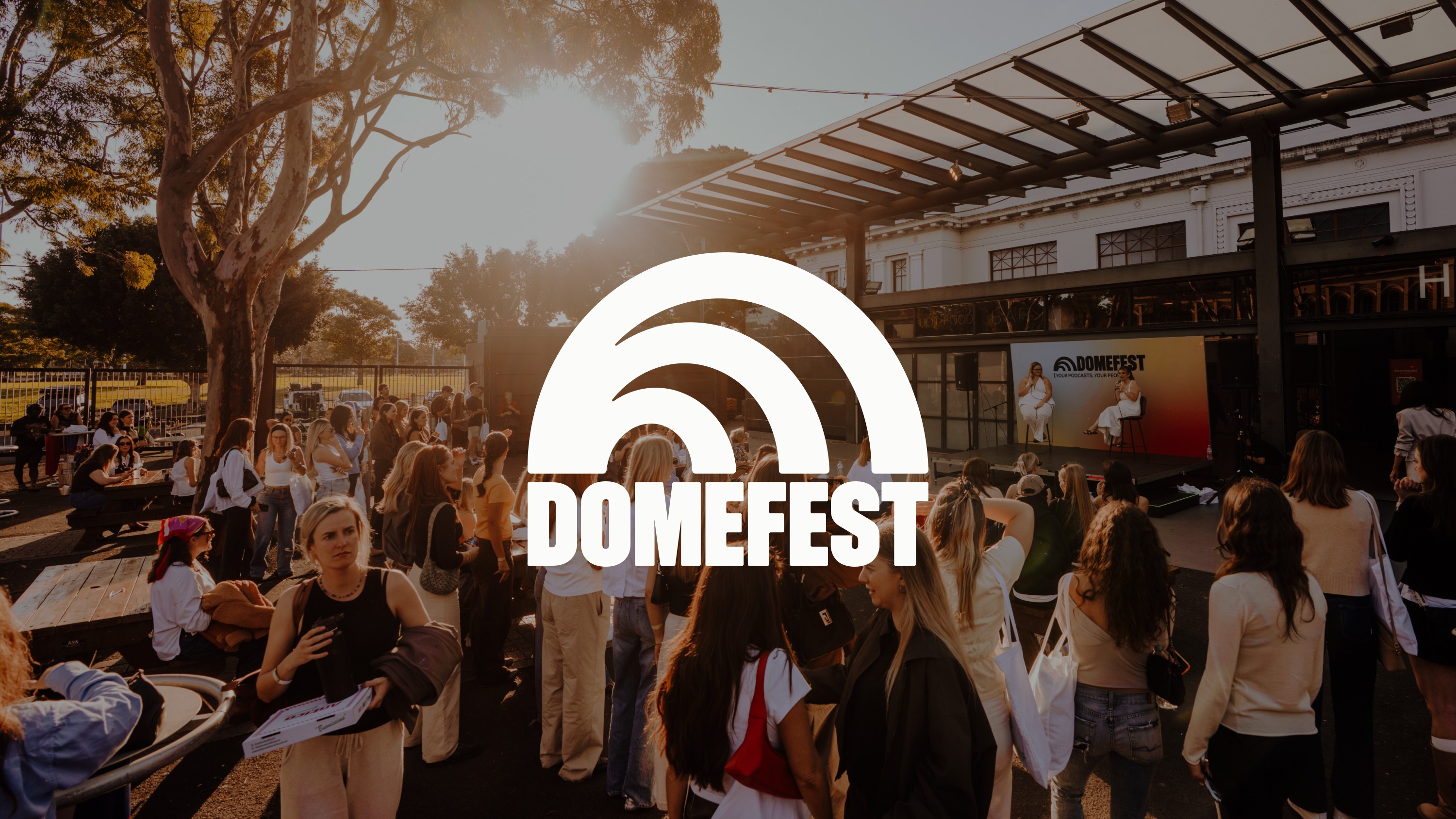
Our approach drew directly from the dome shape in the original Dome logo, reinterpreting it as a symbol of collective voice and amplification. This evolved into a dynamic logomark and hero graphic system featuring rippling elliptical forms, visualising how individual voices expand and resonate when communities come together.

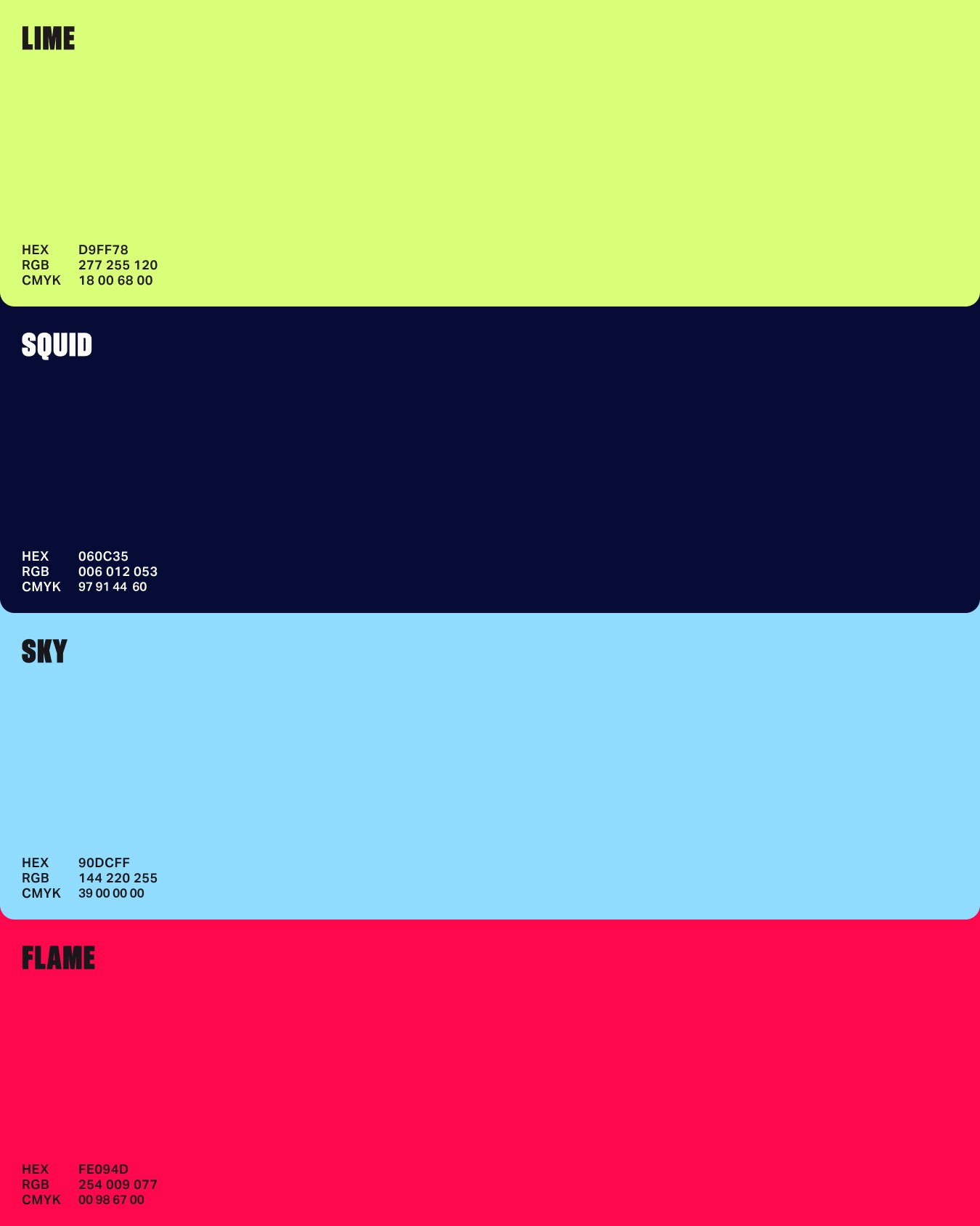
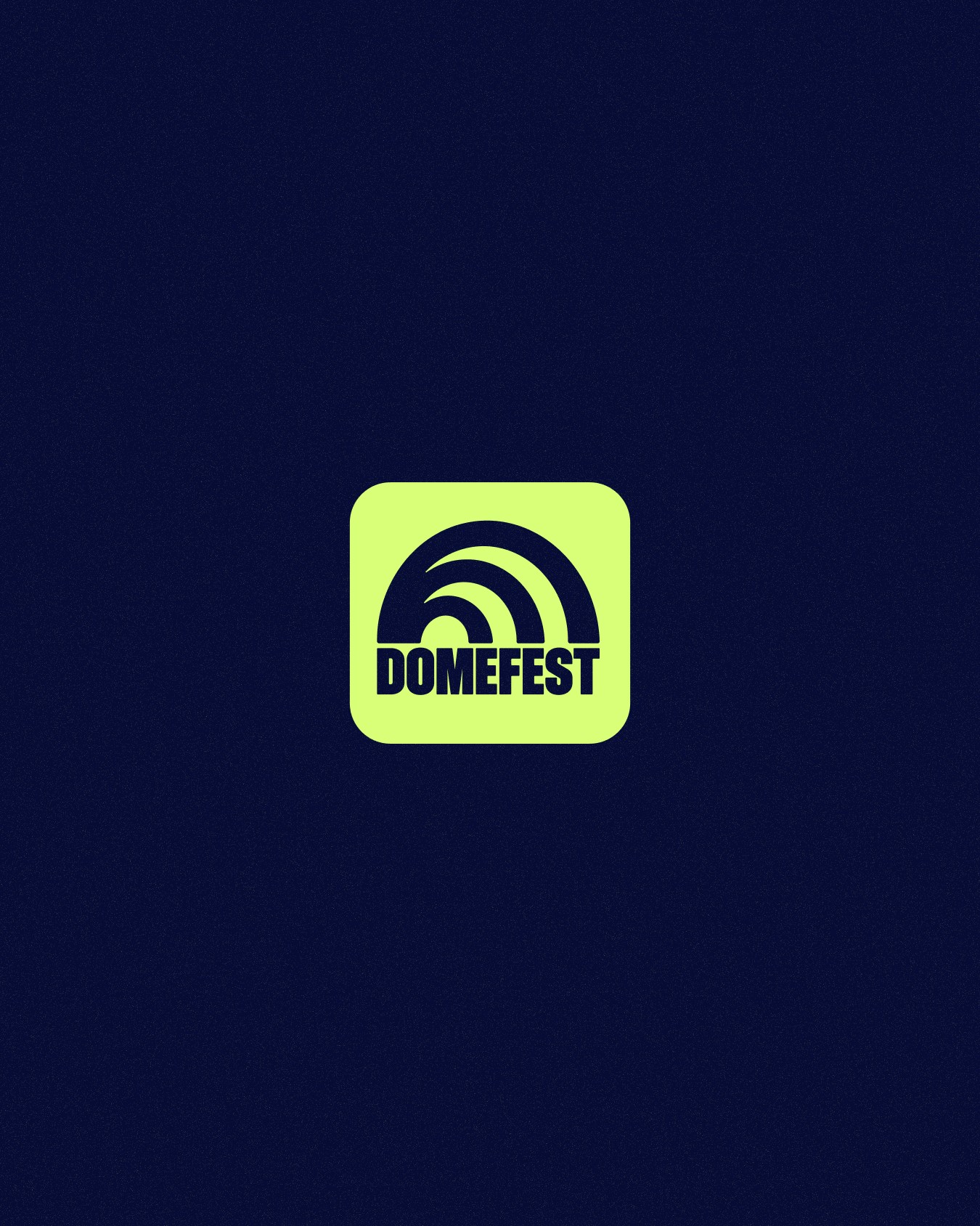


To balance the energy of a festival with the intimacy of podcasting, we developed a flexible design system. Bold typography and vibrant colours conveyed scale and excitement, while organic textures, gradients, micro-graphics, and rounded forms added warmth and reflect the personal nature of listening to podcasts.

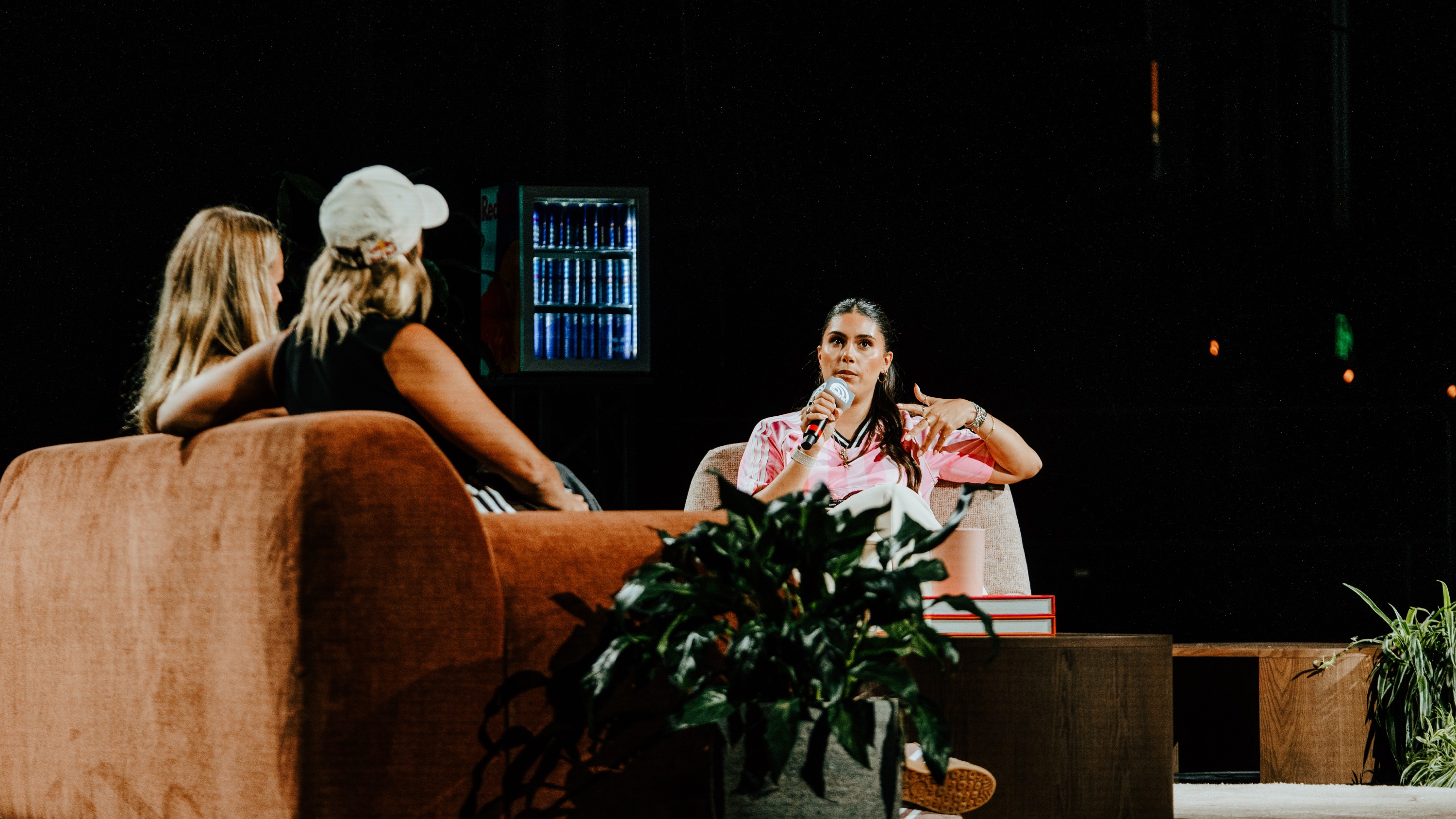


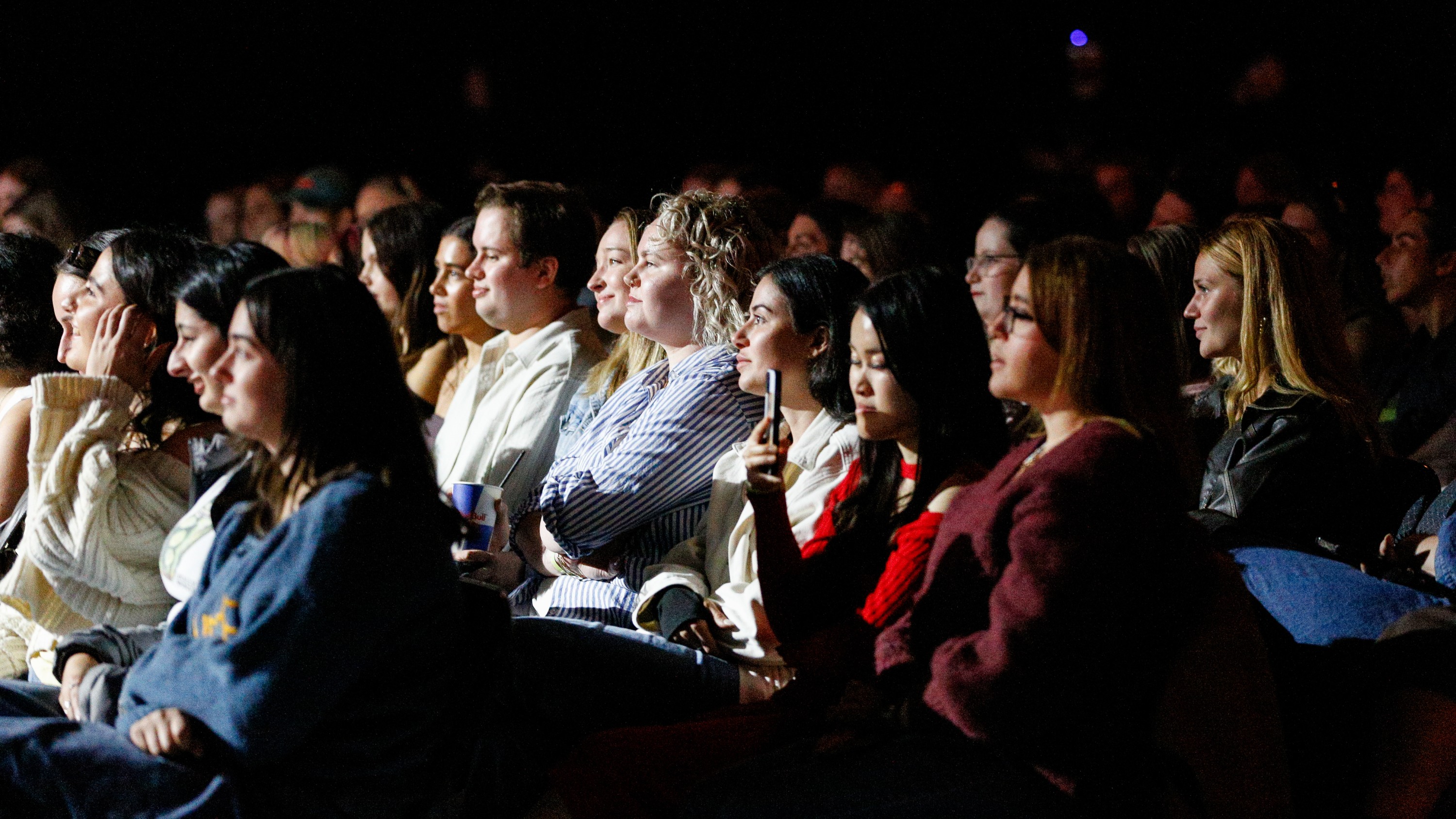

The outcome was incredible. As Australia’s first podcast fan festival, it was important that we made a clear and confident entrance into the market, and Studio 3AM delivered on that.
The brand cut through immediately, drove strong attention, and gave us a distinct point of view. Across social alone, we saw over 2.3M in reach, alongside consistent feedback on how fresh, fun and compelling the identity felt.
Bella Filacuridi
CO-FOUNDER & CxO, dome


Studio 3AM
Creative Direction: Jonathan Key
Design: Misty Paul
Motion Design: Hanseul Lee
Project Management: Ria Gibson
Fonts used
Söhne Schmal by Klim Type Foundry
Aktiv Grotesk by Dalton Maag