GSB Architecture
GSB are the Redfern-based studio of Goodwin, Scarfone, and Belgiorno-Nettis. Their practice is defined by a disciplined balance of form, utility, density, and material efficiency; a philosophy expressed through their identity.
GSB is the architectural studio of Goodwin, Scarfone and Belgiorno-Nettis, practicing architecture as a disciplined balance of form, utility, density, and material efficiency. They engaged Studio 3AM for a rebrand after recognising that their existing brand no longer reflected their design philosophy or the calibre of craft behind their work.
An extensive branding workshop helped us isolate what makes GSB's approach distinct, and shaped a strategy for translating that distinction visually. What emerged was a studio that values structure over ornament, and the intelligent use of space and material. GSB challenge convention through bold, function-driven design — work that speaks through form, resists excess, and stays honest to its materials. Their approach makes more attainable architecture possible.
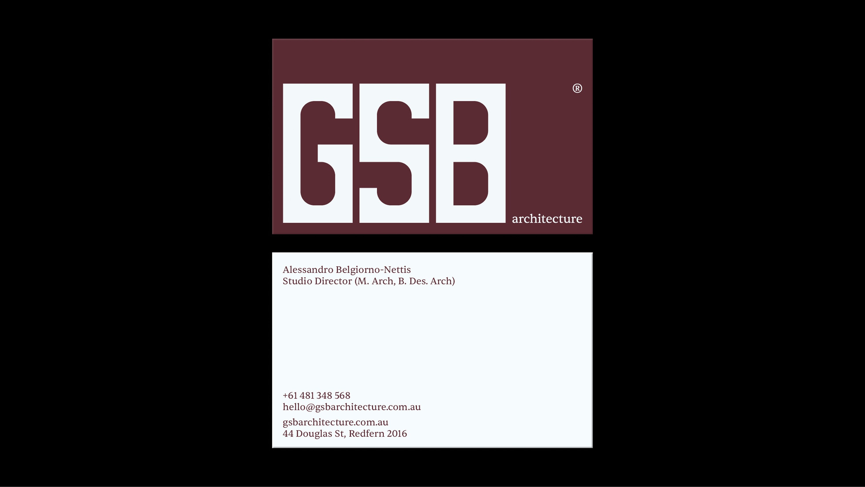
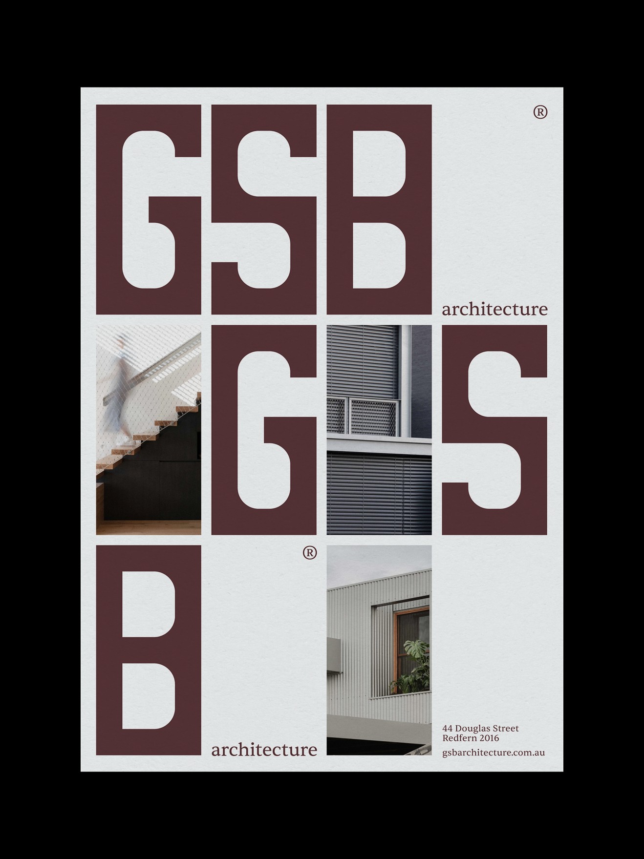
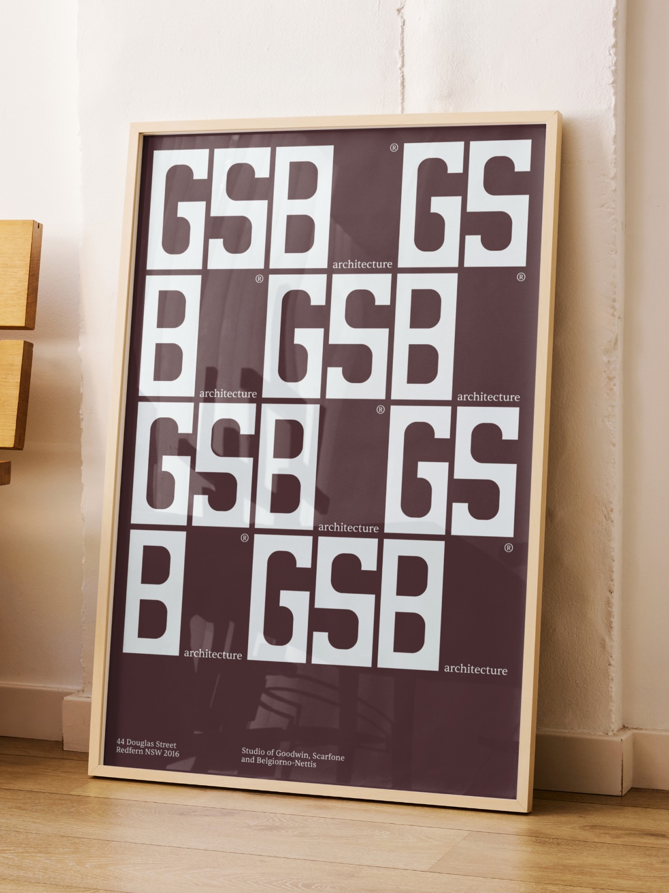
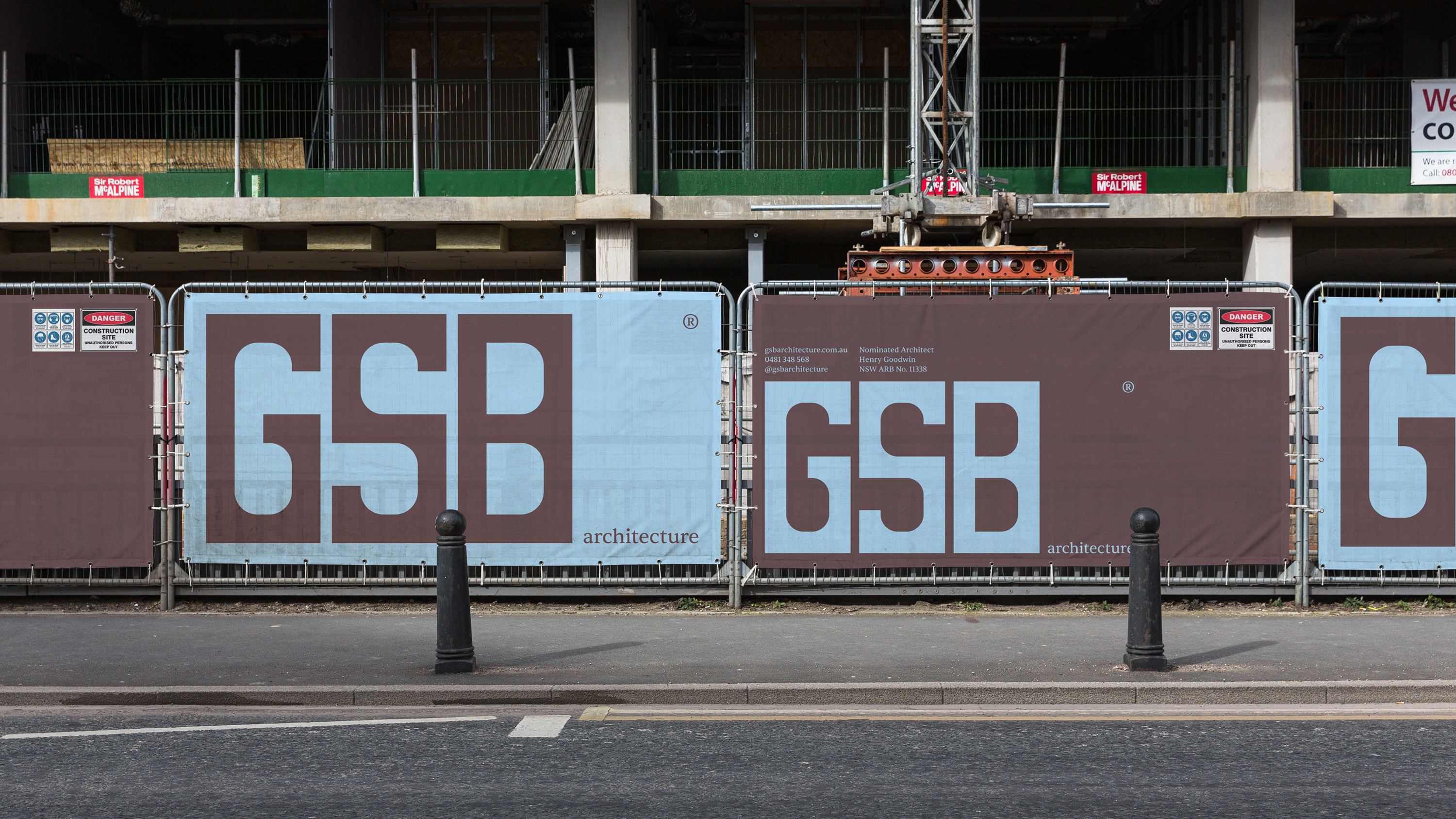
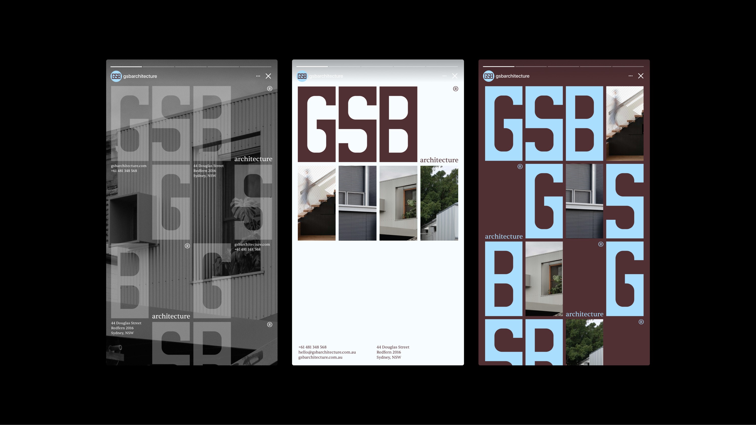
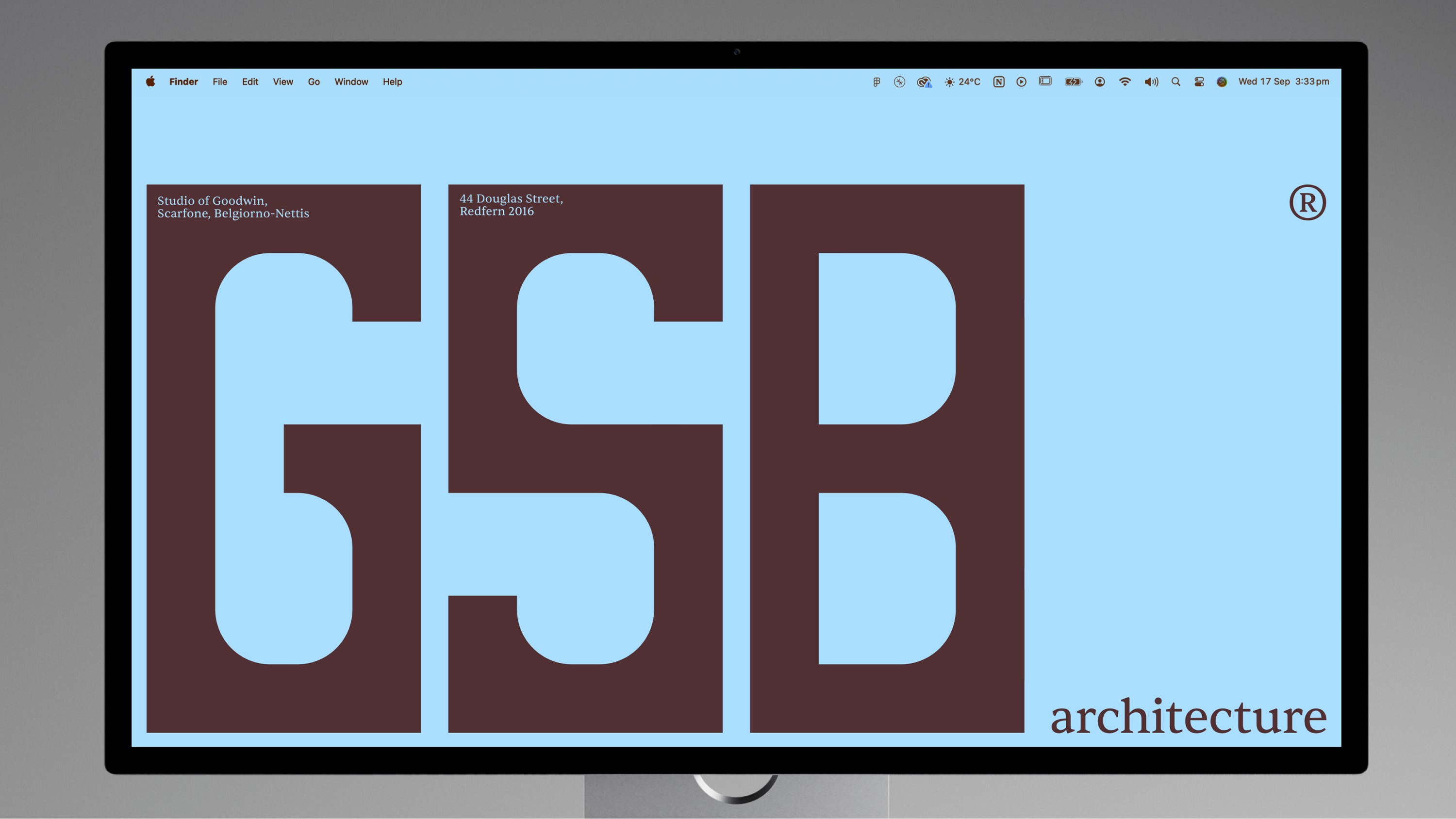
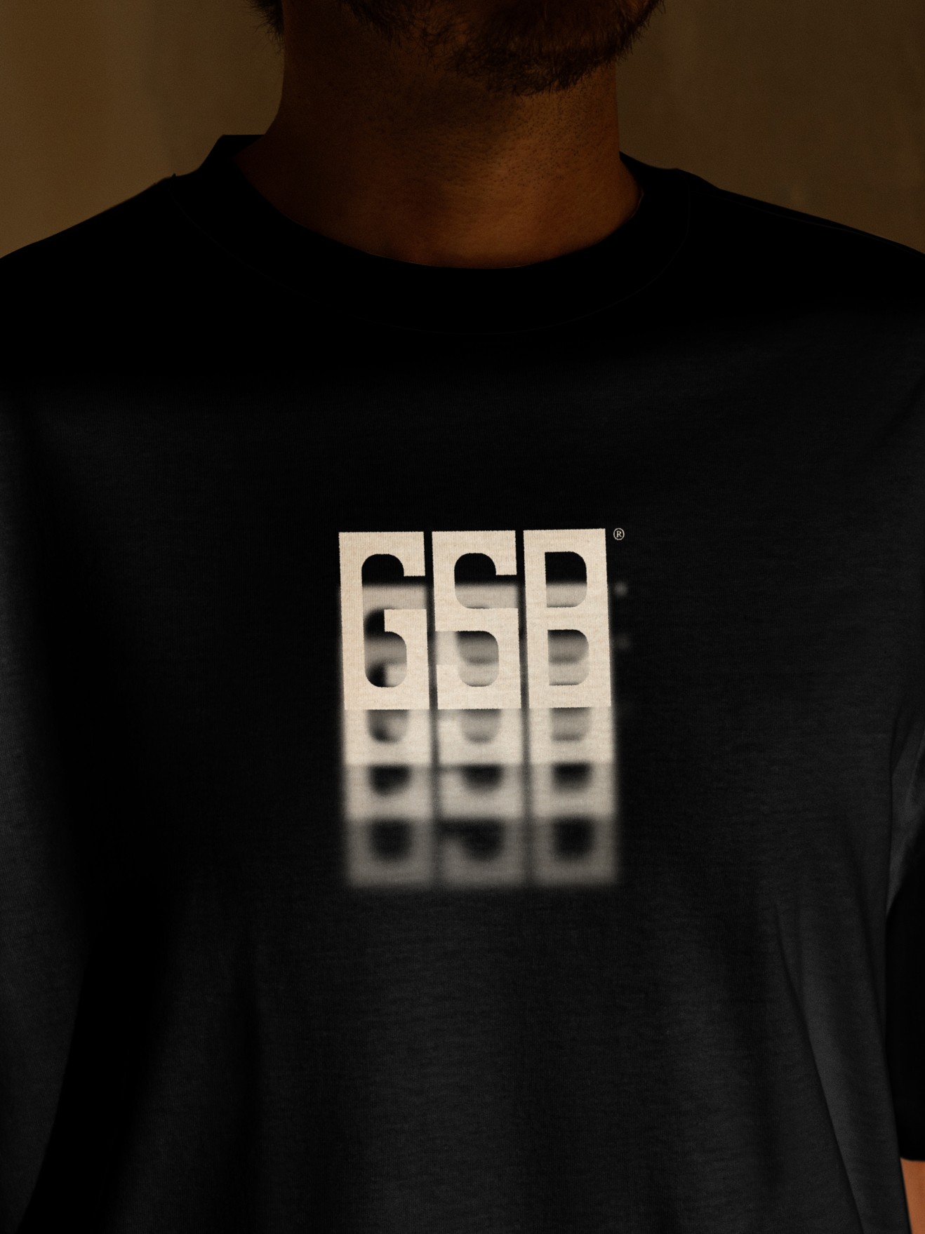
This thinking is built directly into the identity. The handcrafted wordmark sets all three letters within uniform rectangular forms, a structural device that becomes the brand's defining idea. Because each letterform shares the same dimensions, they can be flexibly rearranged within a consistent grid. That grid becomes the foundation for everything the brand does.
From it, a clean, confident, typography-led system follows, with every layout built from the proportions of the logo itself. The system is deliberately restrained, using a single typographic weight to hold clarity and consistency across every application. This discipline mirrors GSB's own design sensibility, producing an identity that feels minimal, timeless, and editorial. It allows the studio to speak with professional confidence while embodying its design philosophy at every touchpoint.
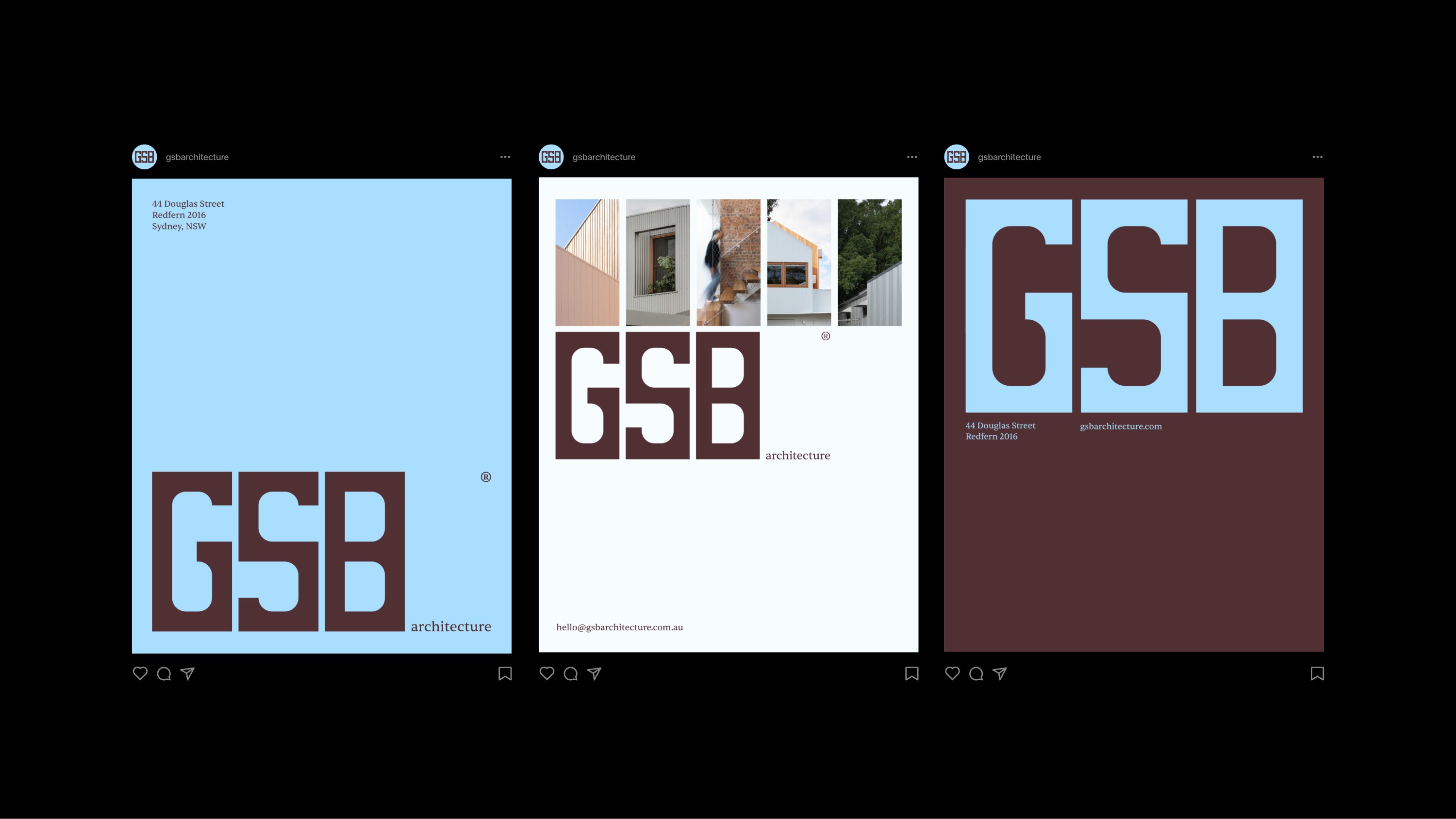
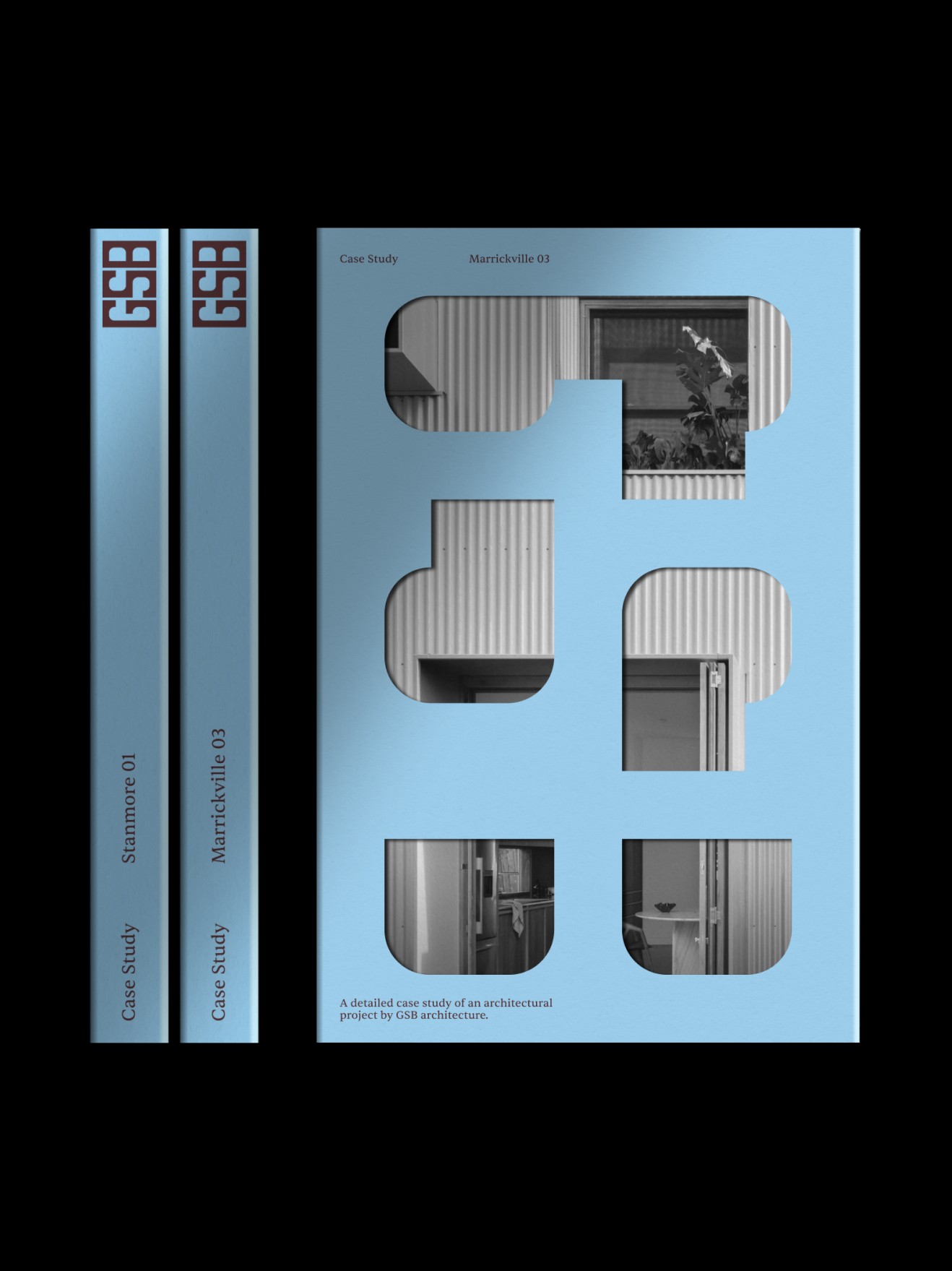
A considered palette of dark brown and pale blue ties the system together, balancing authority with approachability. The dark brown carries weight and credibility; its earthy, unrefined tone echoes the material honesty central to GSB's work. The pale blues bring lightness and openness, softening the palette and keeping the brand feeling accessible rather than austere.
Year
2025
Service
Design, Branding
Sector
Arts & Culture
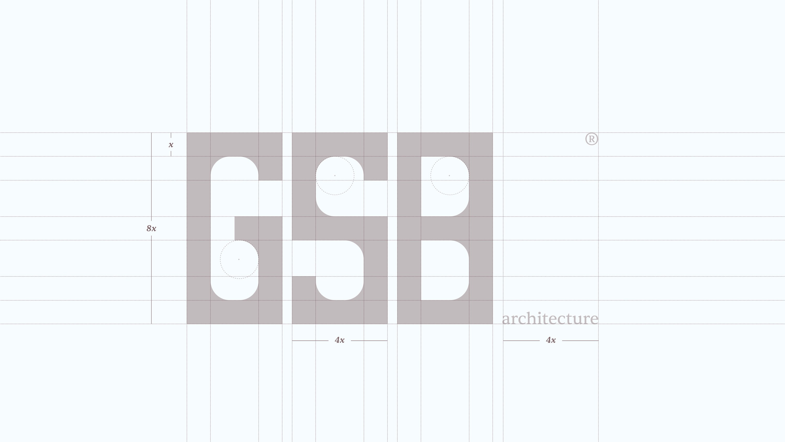
The handcrafted wordmark sets all three letters within uniform rectangular forms, a structural device that becomes the brand's defining idea.
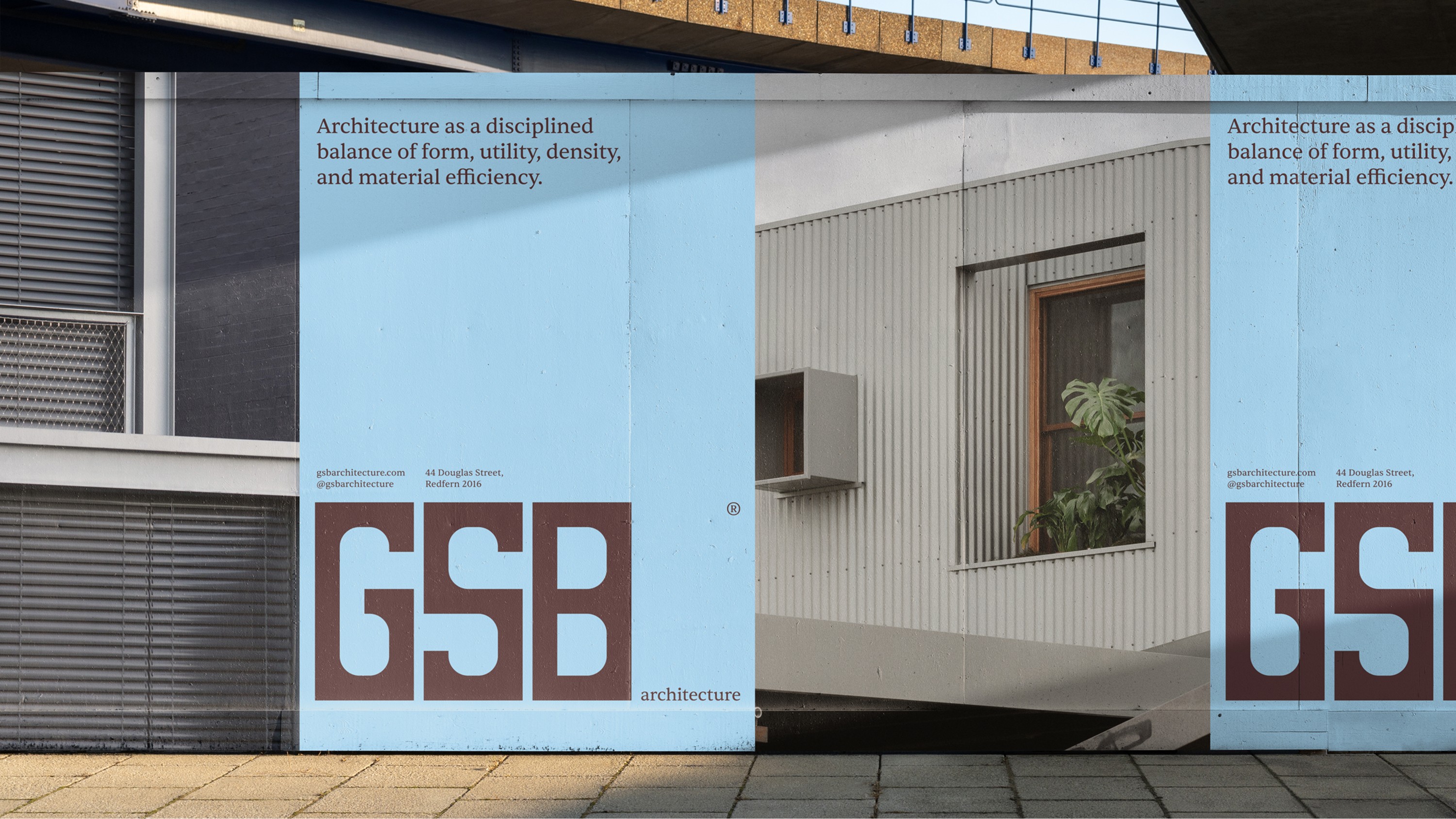
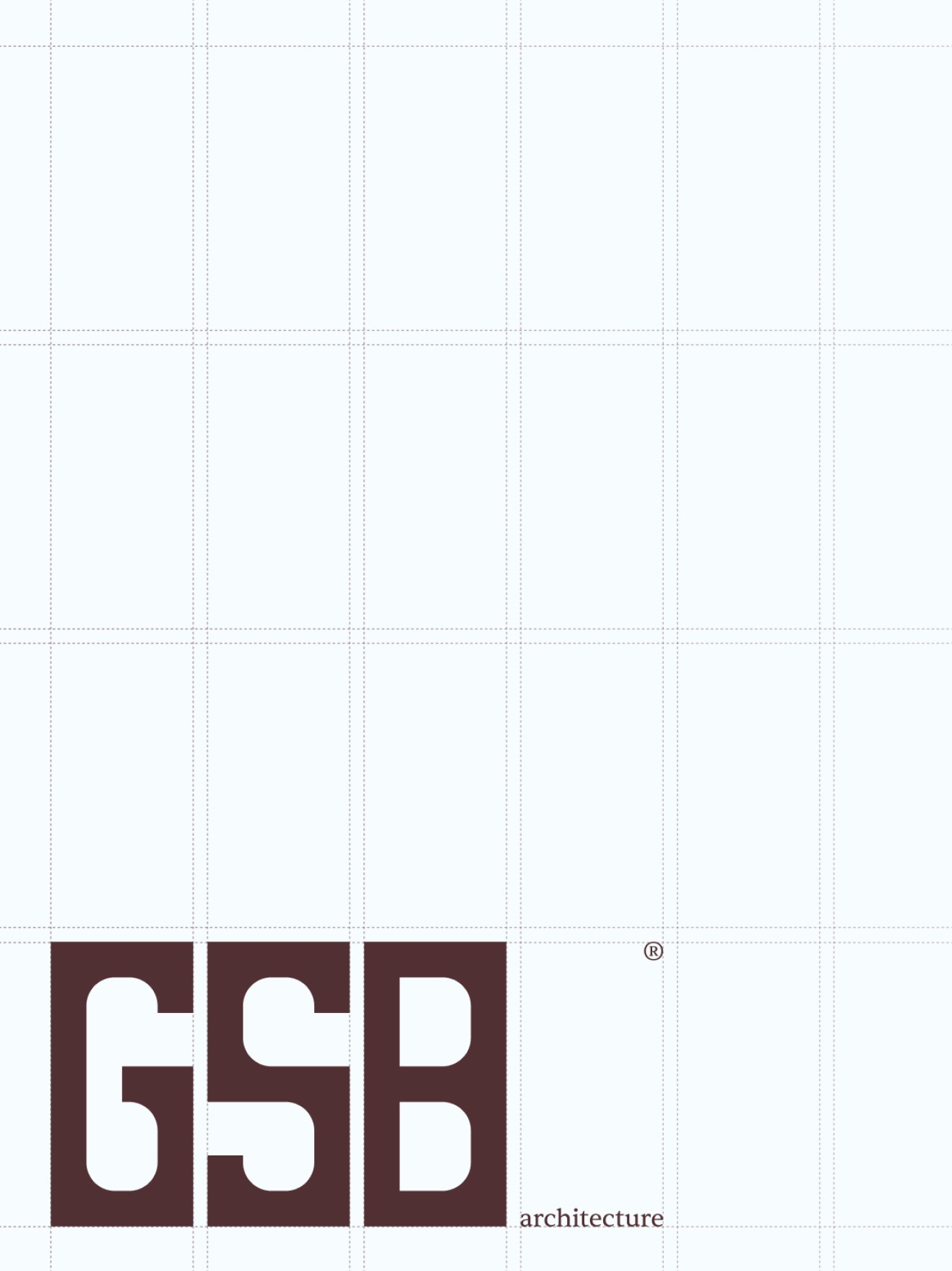
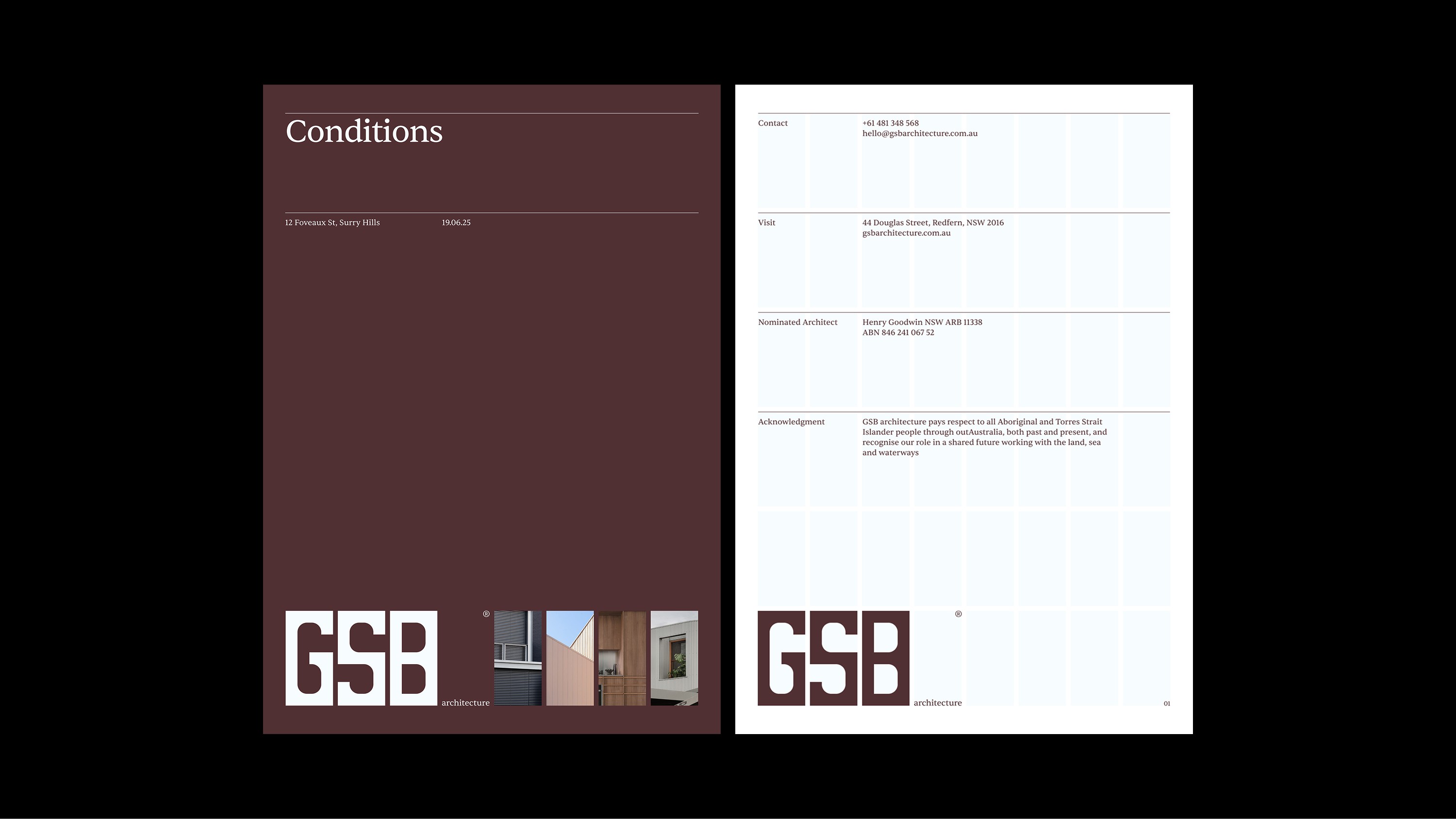
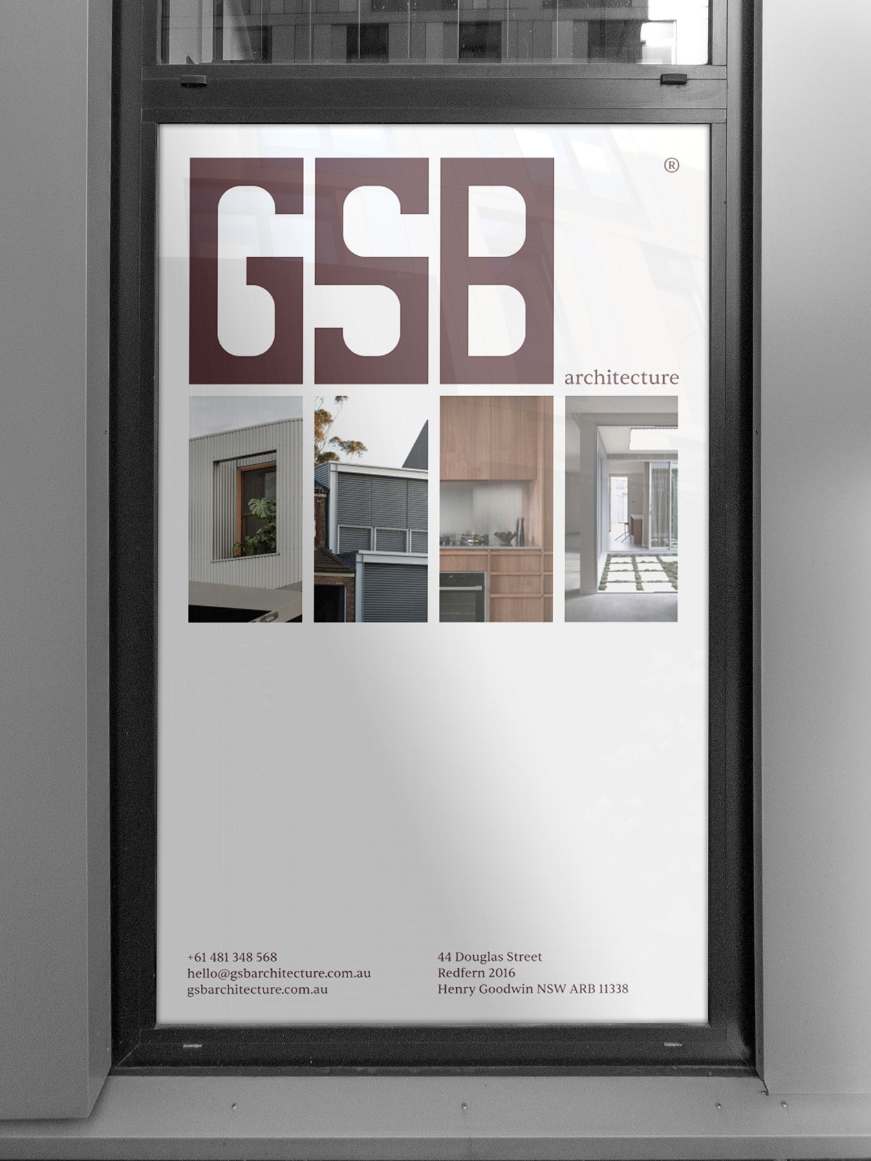
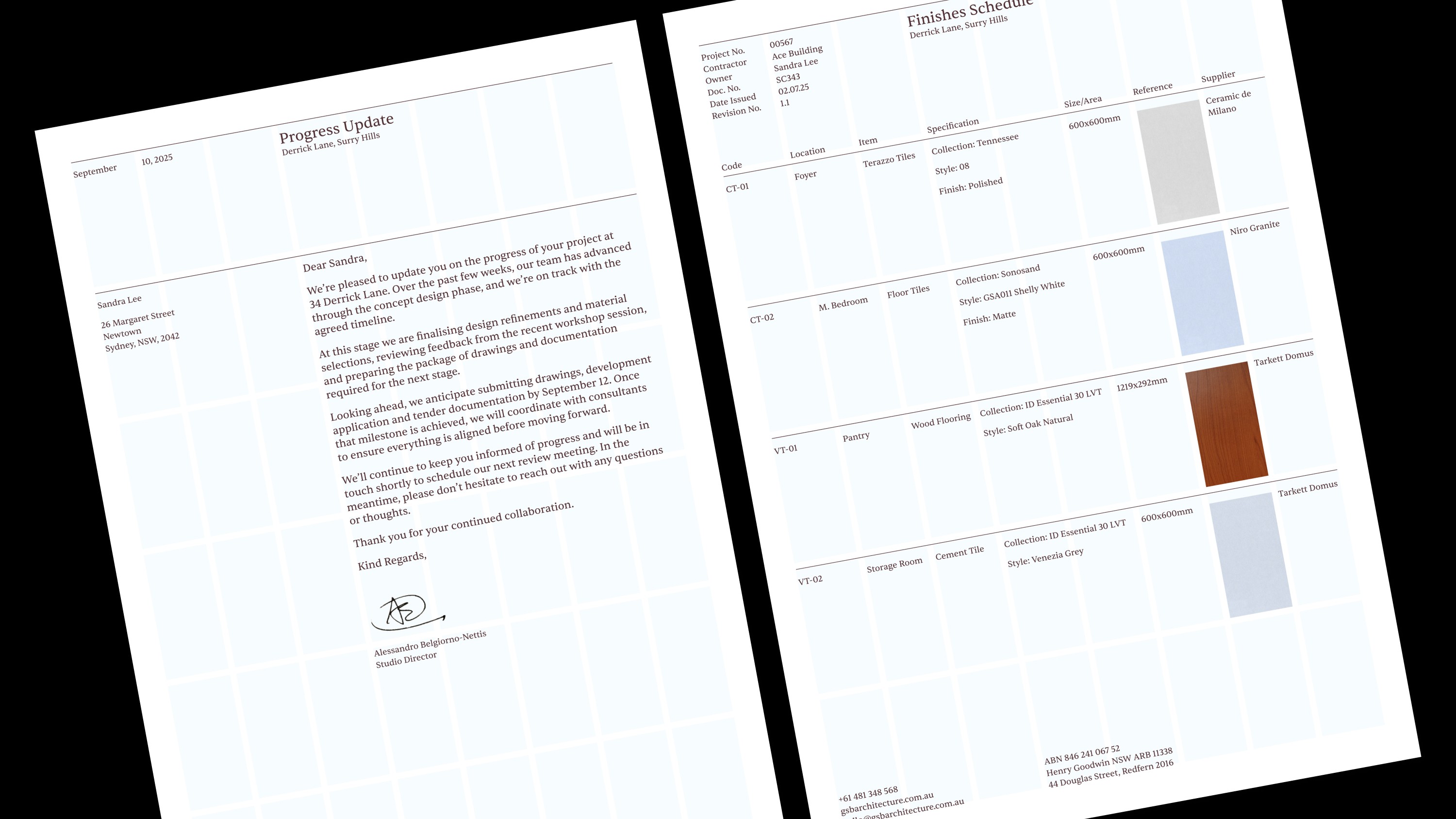
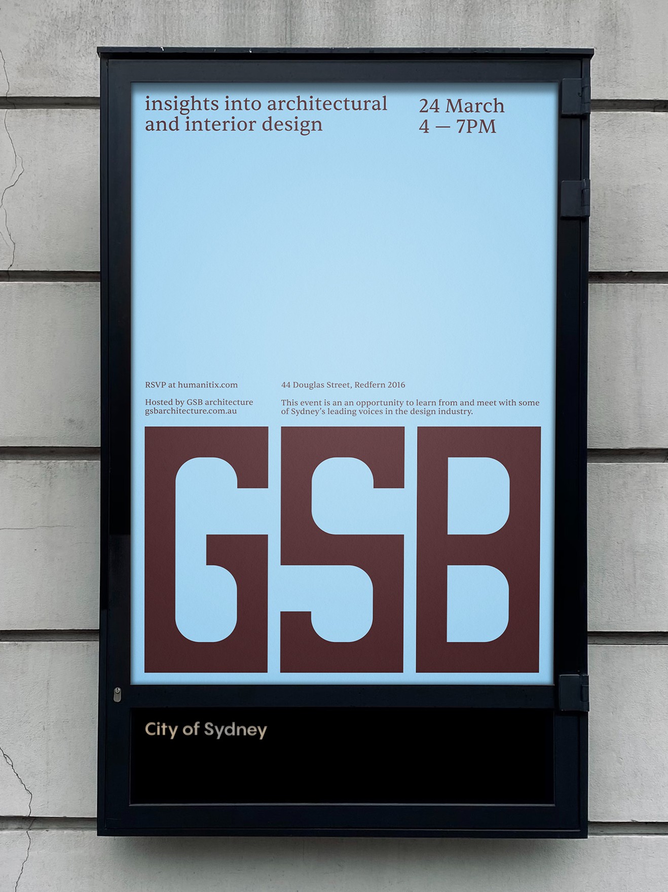
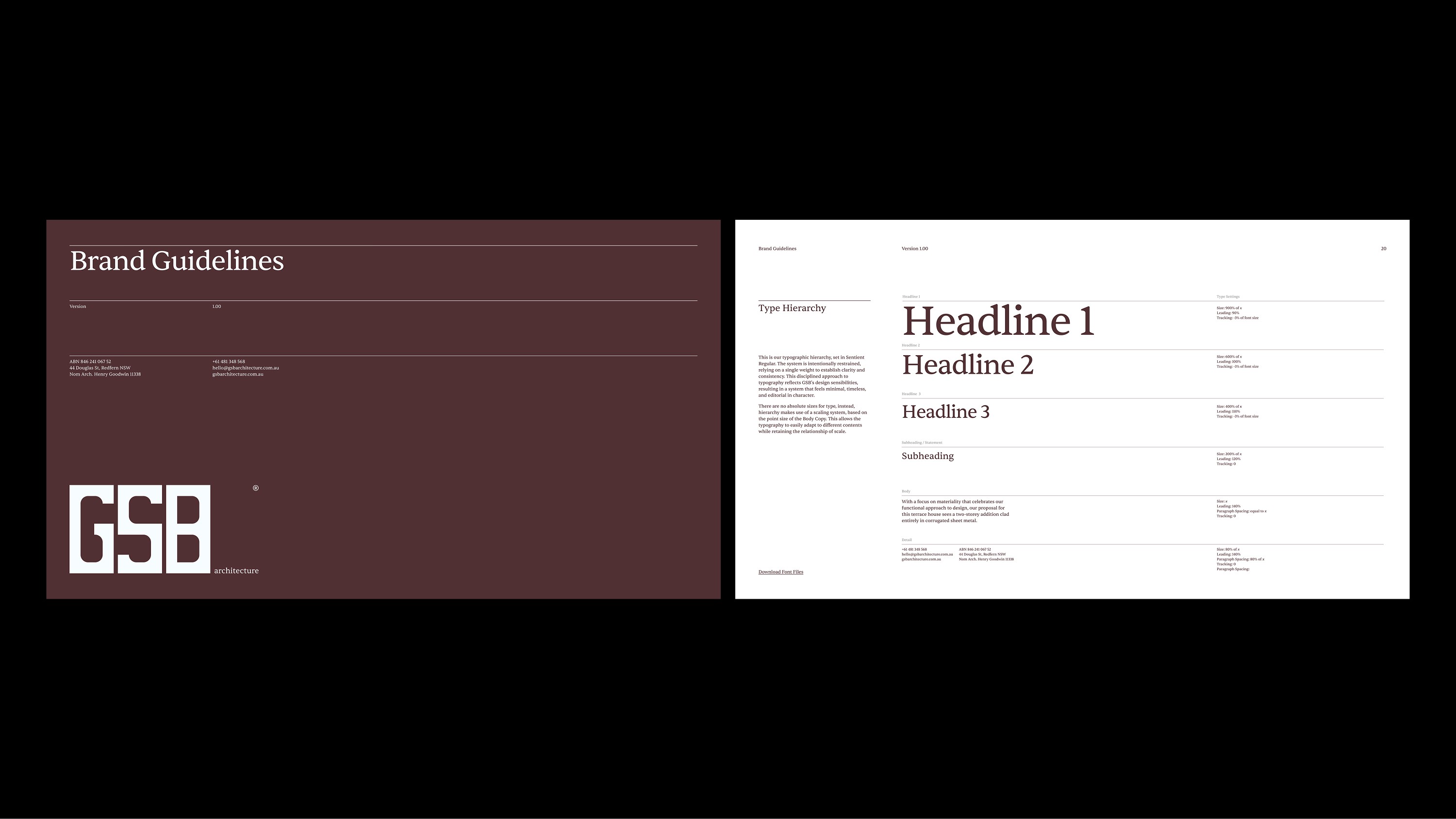
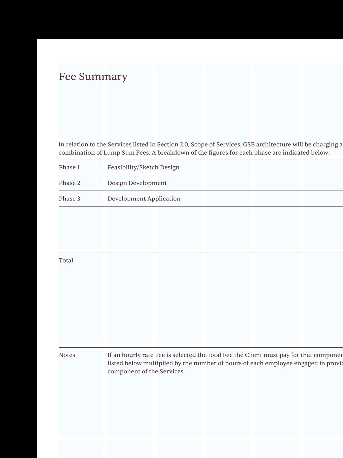
The system is deliberately restrained, using a single typographic weight to hold clarity and consistency across every application.
Studio 3AM
Studio Director: Jonathan Key
Creative Direction: Marty Luther
Design & Art Direction: Mike Spiteri
Project Management: Ria Gibson
Fonts Used
Sentient Regular by Indian Type Foundry