Novon
A new identity for an Australian lighting innovator connecting people to spaces through light.
Novon is an Australian-owned lighting innovator focused on connecting people to spaces. Studio 3AM was engaged to rename and rebrand the business, creating an identity that reflected its commitment to innovation, circularity and local manufacturing.
We created the name Novon by combining ‘Nov’, the Latin root for ‘new’, with ‘on’, representing ongoing innovation. Its palindromic structure reflects the circular thinking behind the business and its approach to sustainable manufacturing.
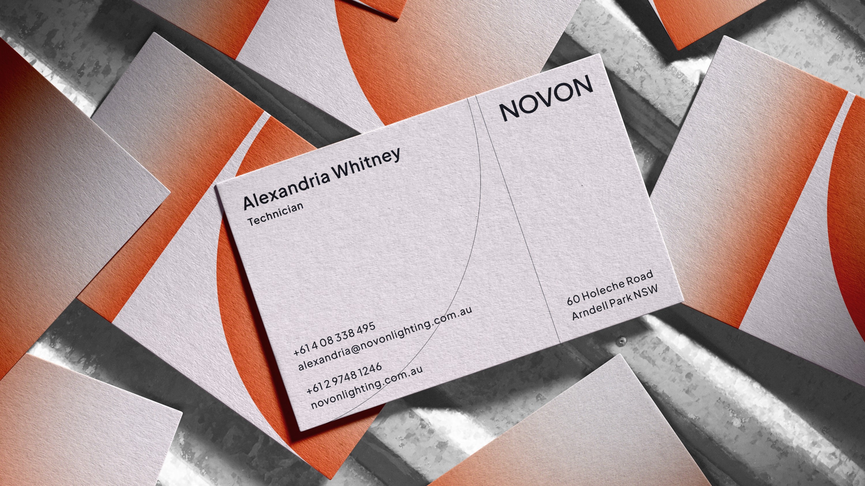
The identity builds from a geometric ‘N’ mark, where negative space creates a pathway moving upwards. Curved and straight grid lines reference technical drawings and the geometry of the logo, while illuminating gradients represent light moving through space. Bold typography and a considered colour palette position Novon as a confident and progressive lighting brand.
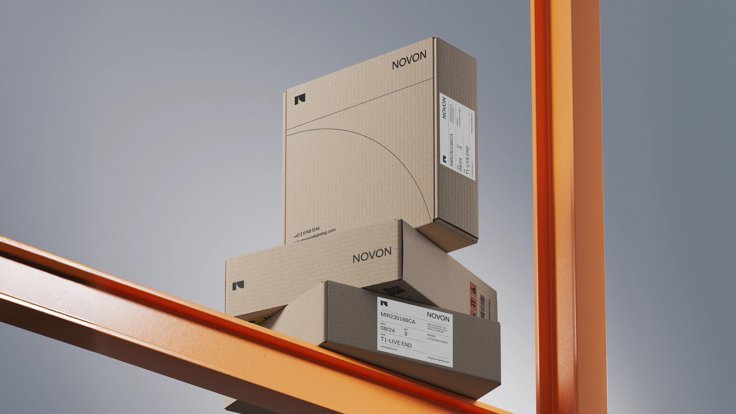
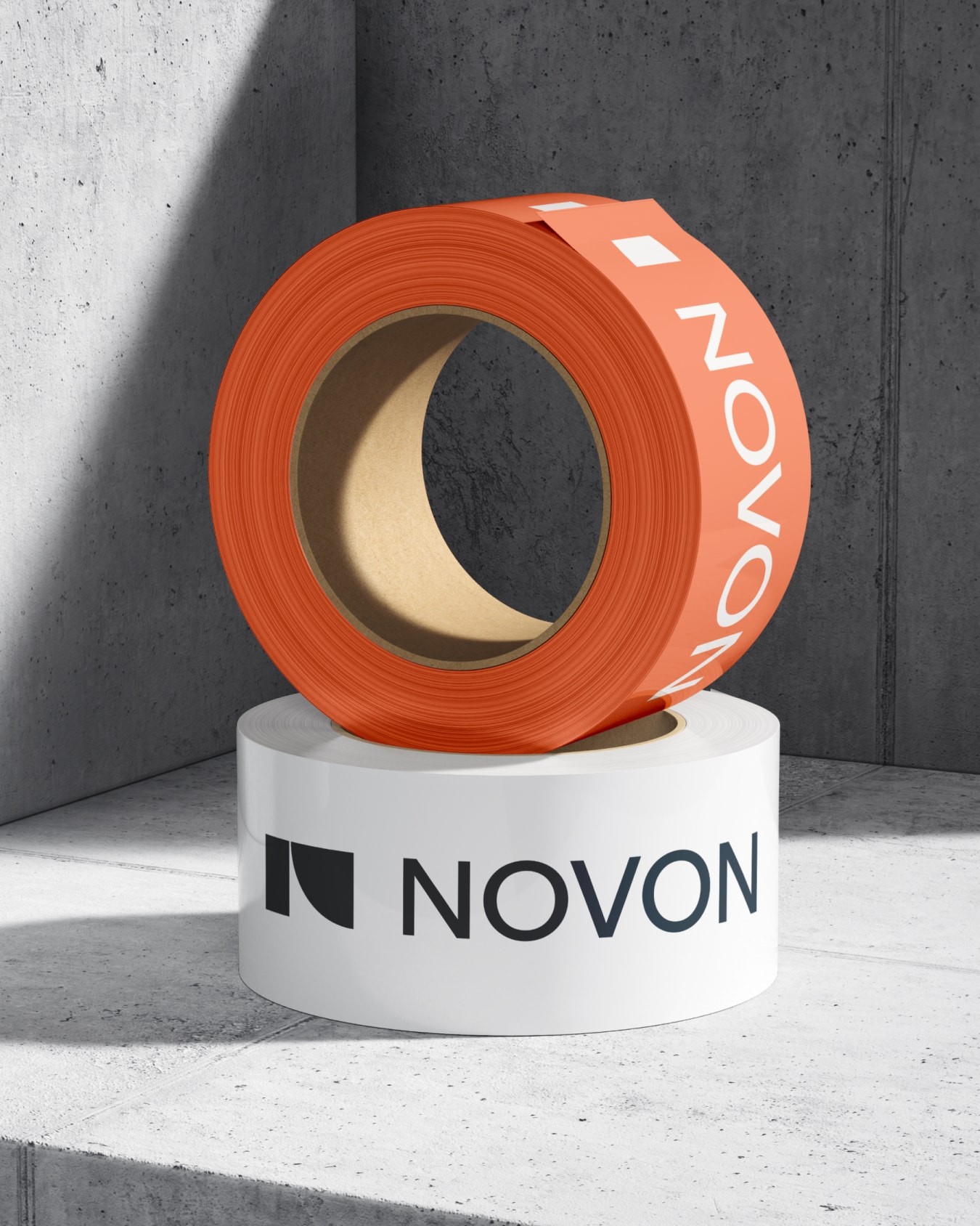
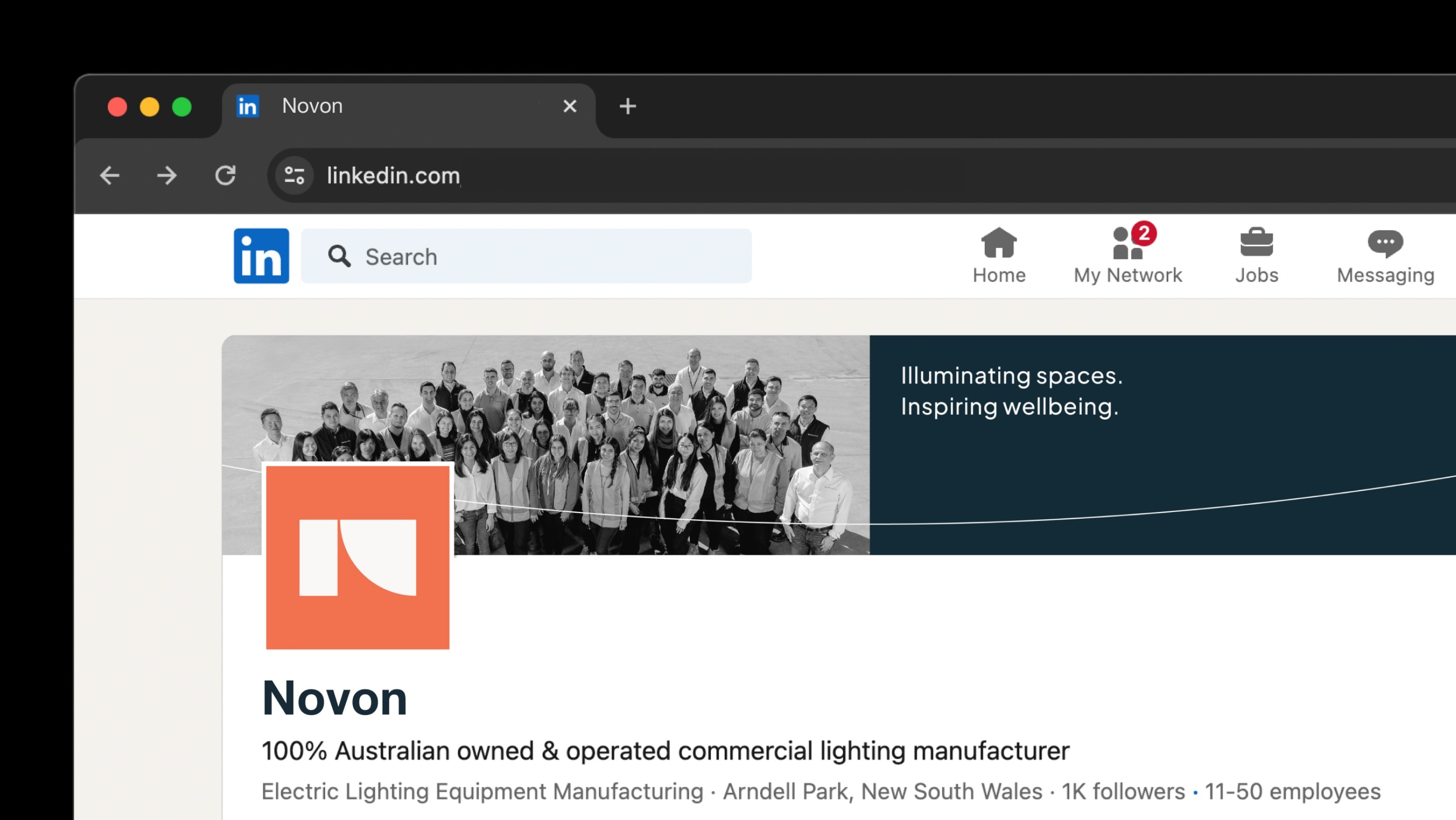
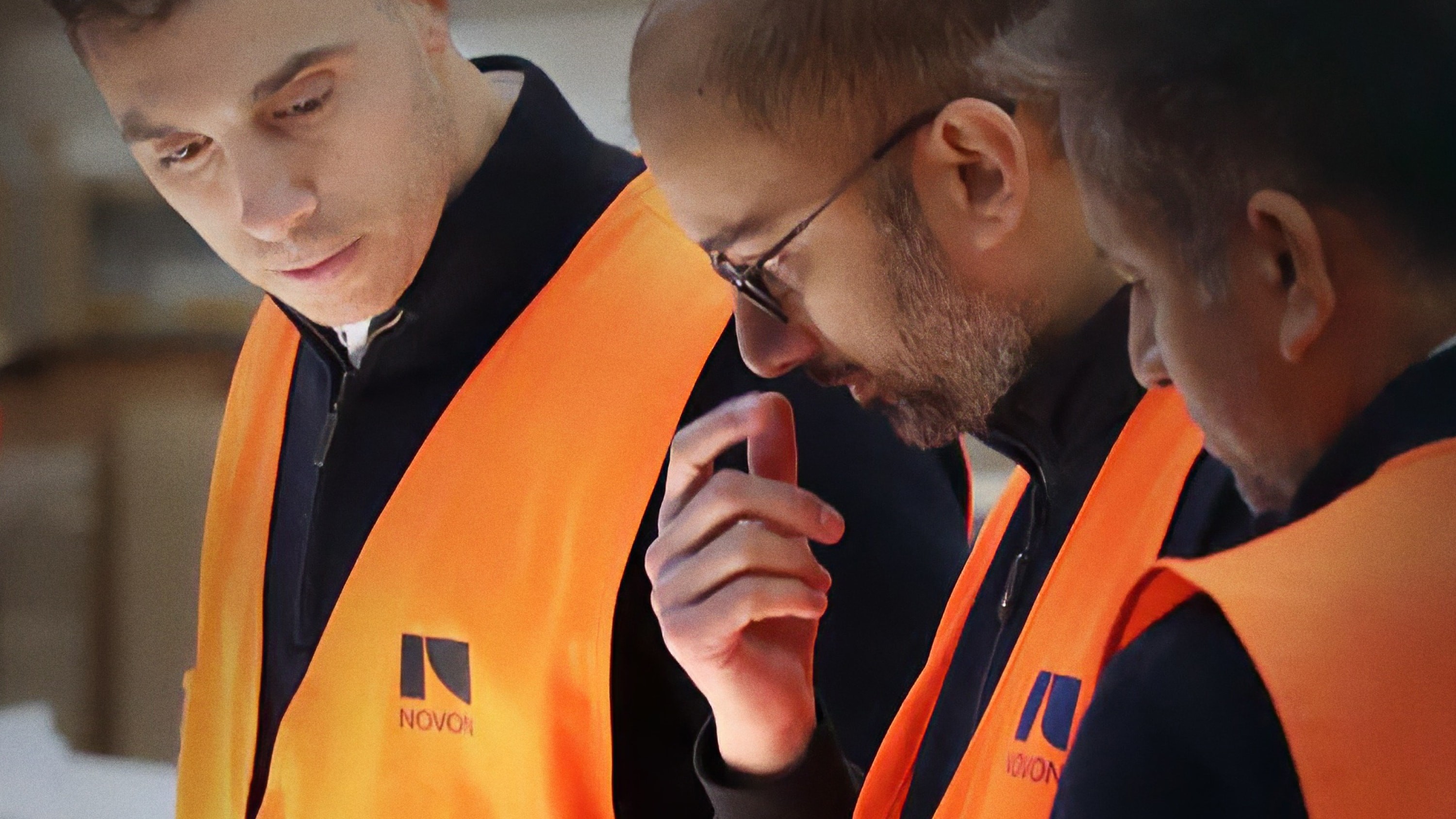
The identity creates a complete brand system across language, photography, packaging, digital and iconography, giving Novon a clearer expression of its approach to innovation and design.
Year
2023
Service
Design
Sector
Technology & Innovation

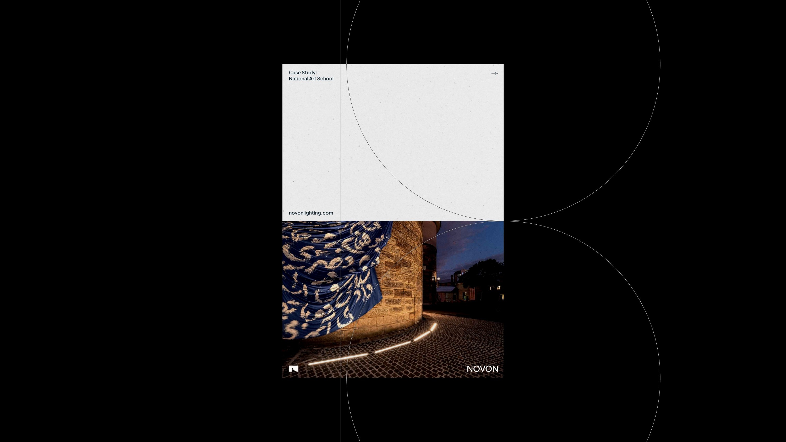
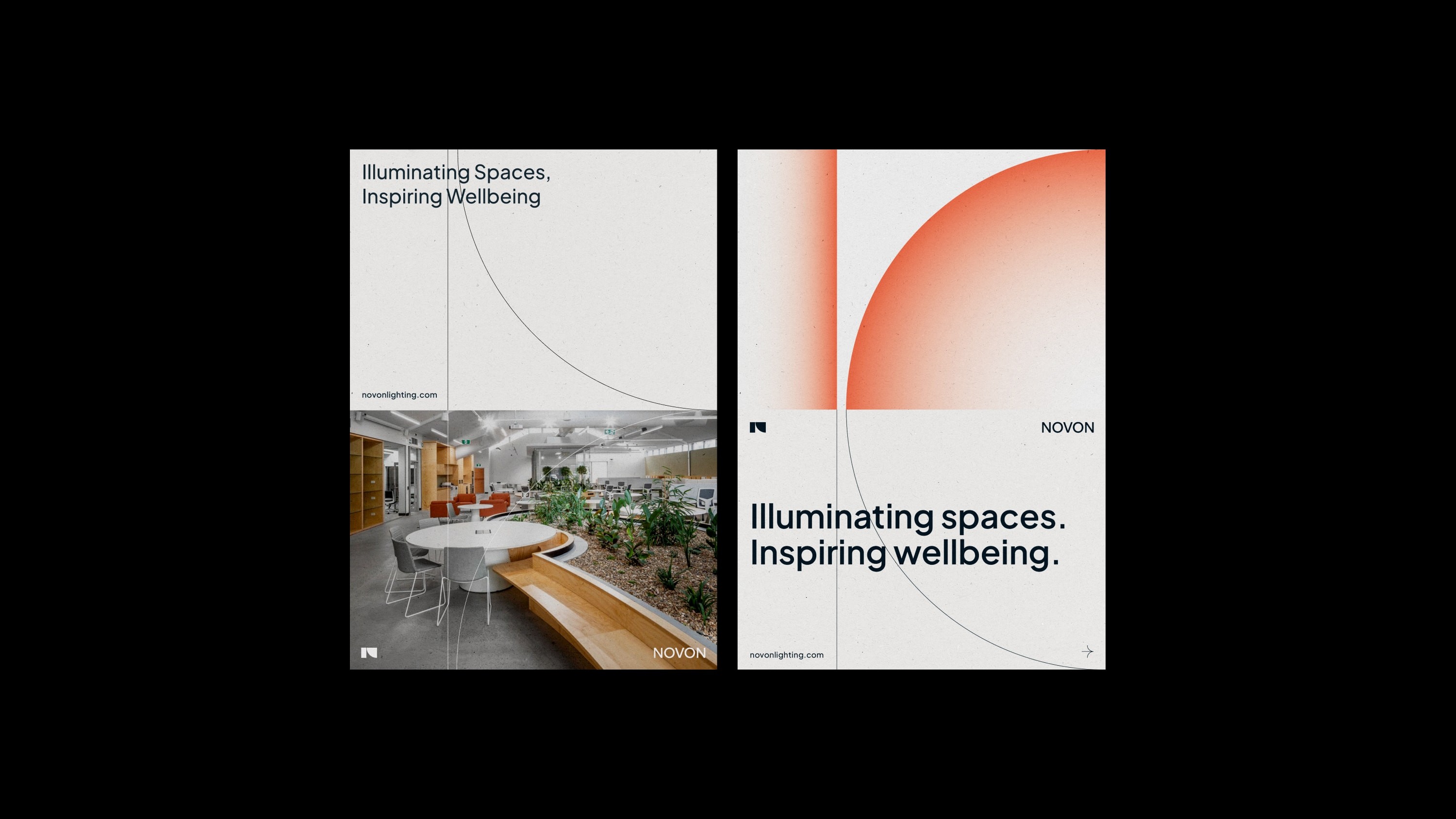
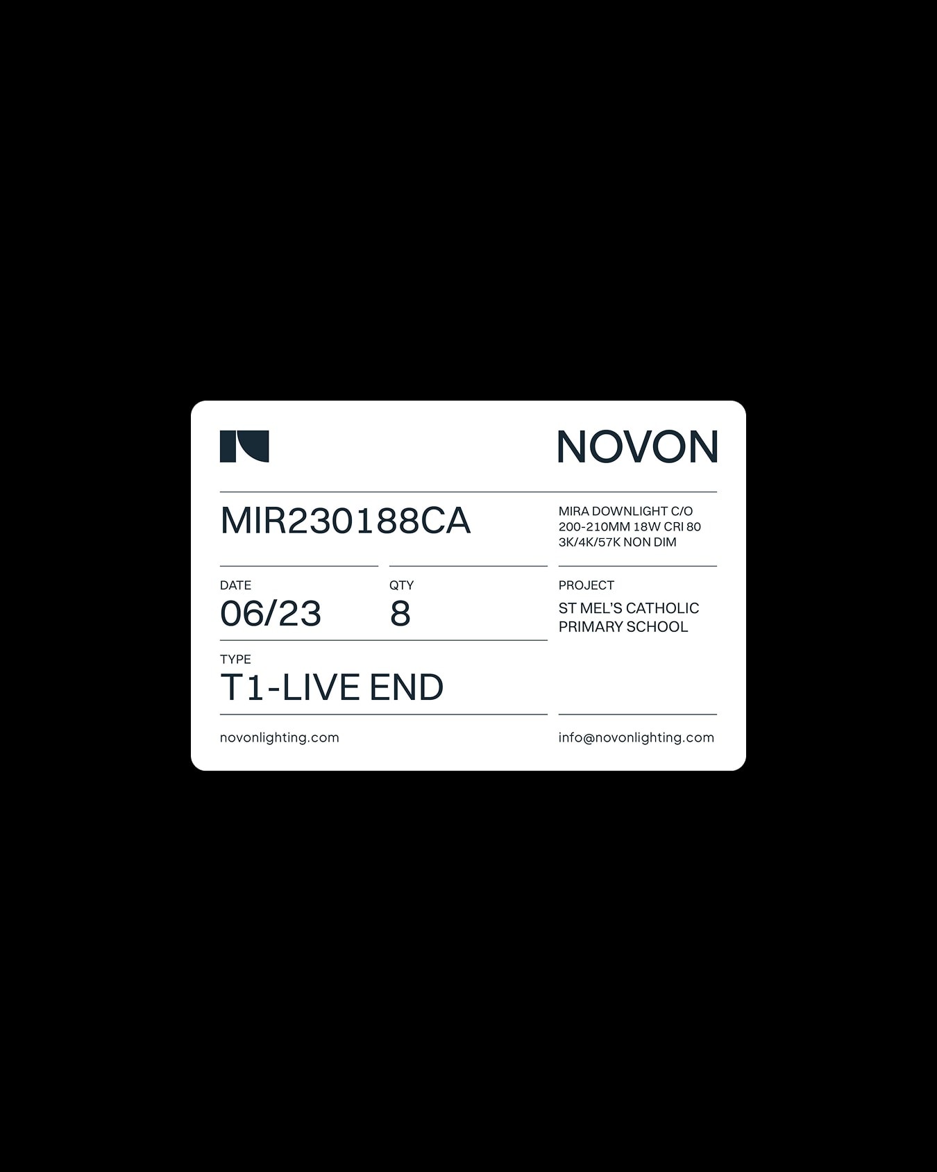
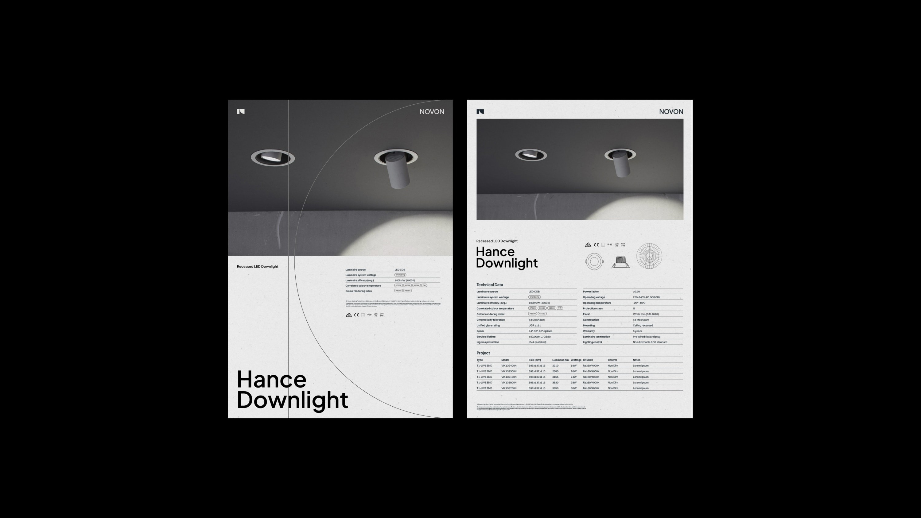
The geometry of the monogram ‘N’ dictates the spacing across print layouts, as shown above.
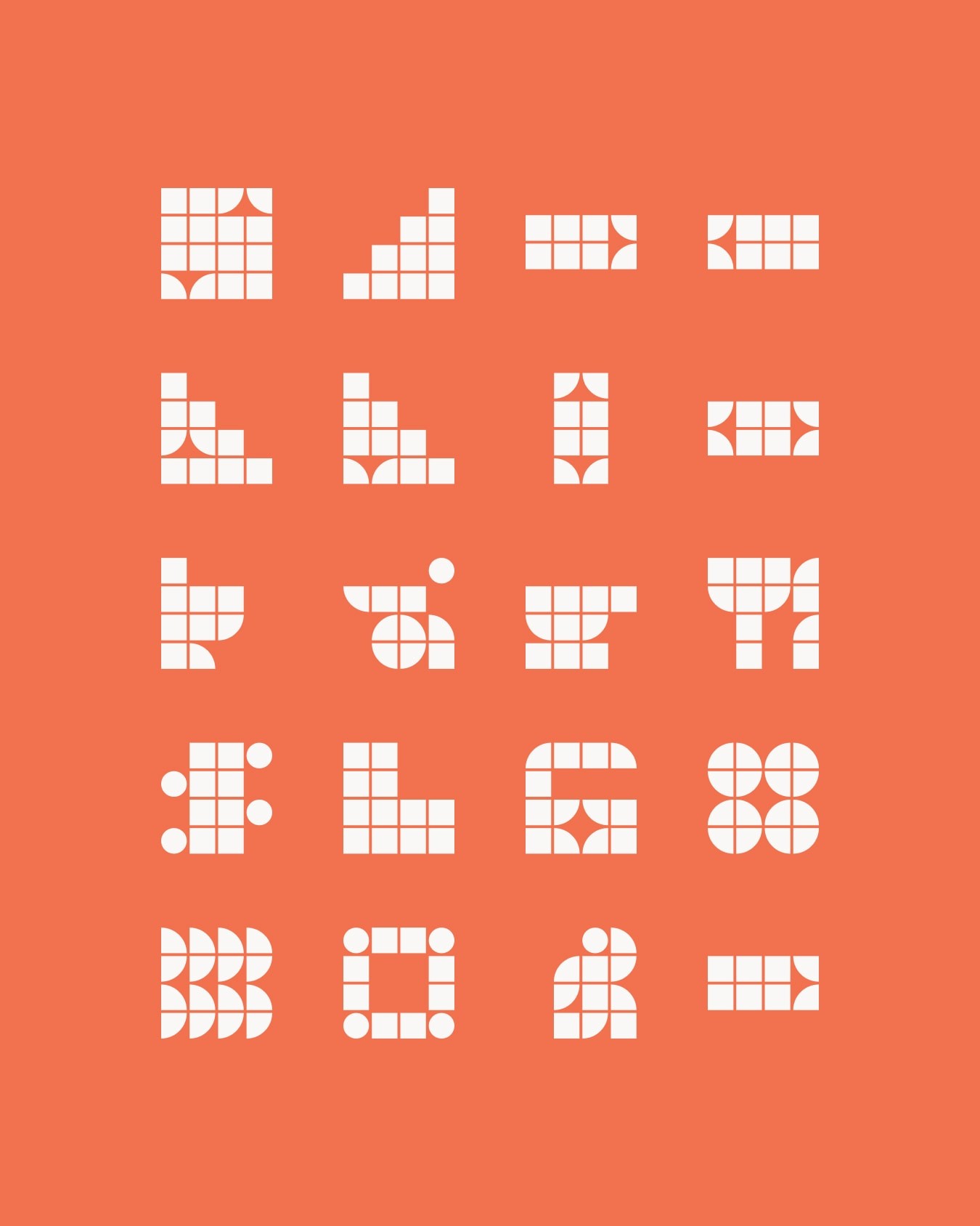
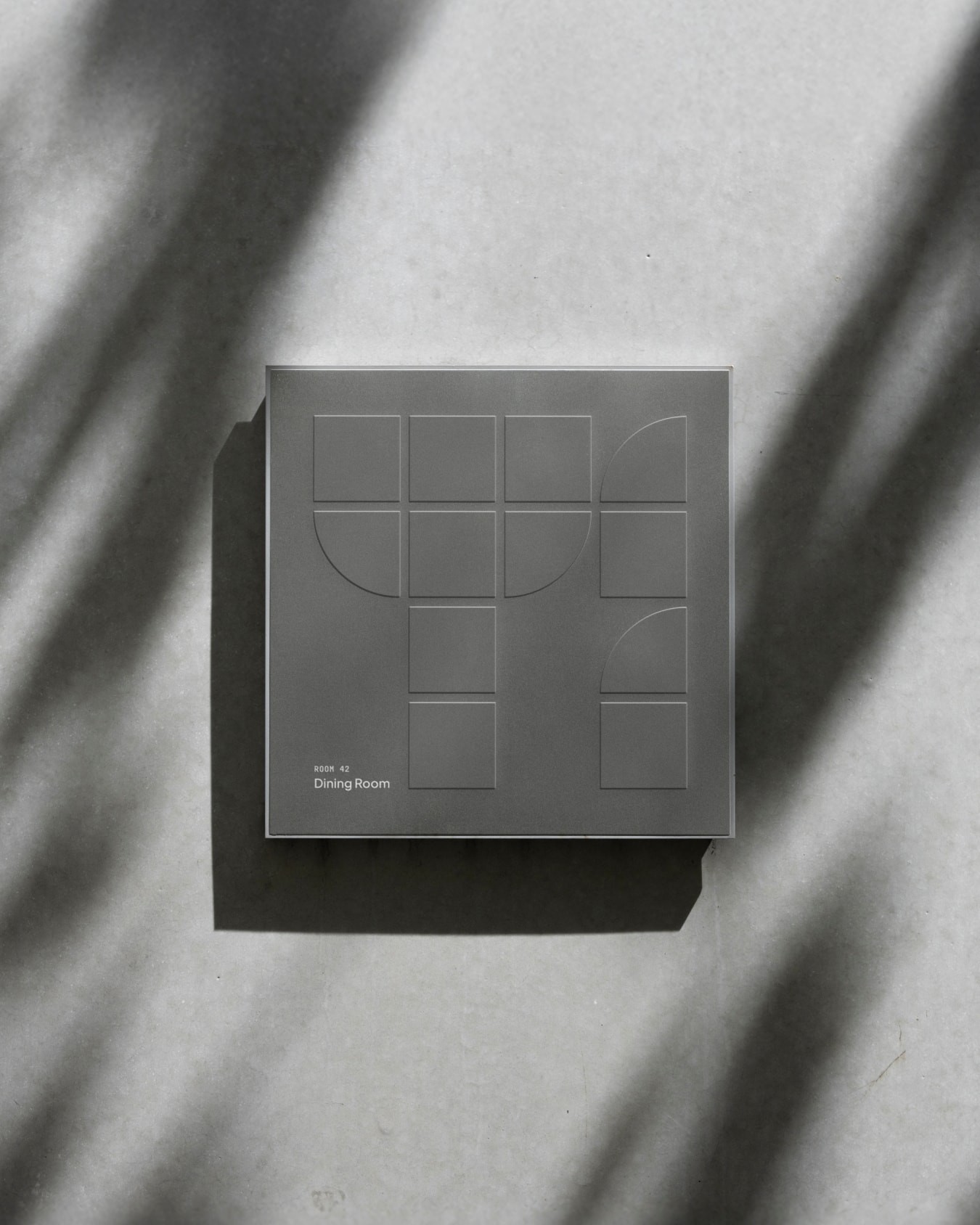
Wayfinding iconography was developed from segments of the core forms within the Novon logo. These symbols were used across the site to guide navigation while also representing the brand’s core values.
Studio 3AM
Creative Direction: Jonathan Key, Marty Luther
Strategy: Earnest Capangpangan
Art Direction: Julia Favaloro
Design: Julia Favaloro, Mike Spiteri, Su Wing, Marty Luther
Motion Design: Katrina Che, Hanseul Lee
Project Management: Ria Gibson
Fonts used
Plus Jakarta Sans by Gumpita Rahayu from Tokotype